Hi, I'm Azmain!I've been building startups for 6 years.

The AI Copilot for Running Small Businesses
An AI agent that proactively automates business processes such as content marketing, bill payments, and lead generation. It eliminates office admin for busy owner-operators at a fraction the cost of hiring a human business manager.
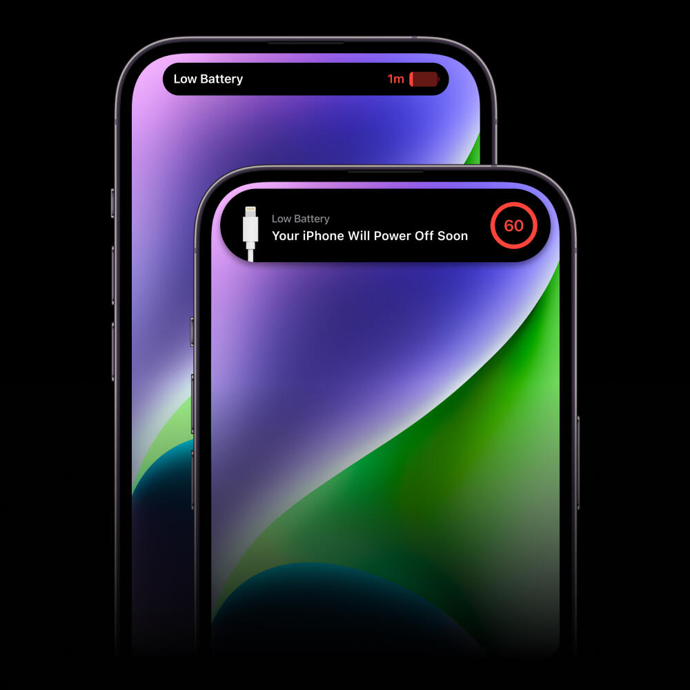
Low-Battery Countdown for Dynamic Island
A system alert that warns you to plug in your iPhone shortly before the battery dies. It augments the 20% and 10% battery life alerts handled by iOS; giving you a final chance to message that friend or hail a ride home.
App for Finding Things to Do With Friends
A vertical-video mobile app for locals to find, share, and make plans in the real world. It lets you discover videos of fun venues nearby, check the place's reviews, and buy tickets or make reservations – all at the speed of your group chat.
International Crowd-Shipping Platform
The most transparent and affordable way to send packages worldwide. This responsive web app lets you register to ship parcels with friendly air travellers, estimate how much that'll cost, and track your package throughout its journey.
An Azmain Abrer Project
Made With ♡ in Canada
Inspired by Apple in California
An Azmain Abrer Project
Made With ♡ in Canada
Inspired by Apple in California
/ˈaz•main/
founder, designer, product manager
1. obsessively curious.
"azmain is not afraid to ask silly questions"
2. irrationally persistent.
"azmain started building AI products in high school"

An Azmain Abrer Project
Made With ♡ in Canada
Inspired by Apple in California
An Azmain Abrer Project
Made With ♡ in Canada
Inspired by Apple in California
Oops!This is a construction zone.
An Azmain Abrer Project
Made With ♡ in Canada
Inspired by Apple in California
An Azmain Abrer Project
Made With ♡ in Canada
Inspired by Apple in California
The AI Copilot for Running Small Businesses
Winter 2024 – Winter 2025 • UI/UX Design, Product Management
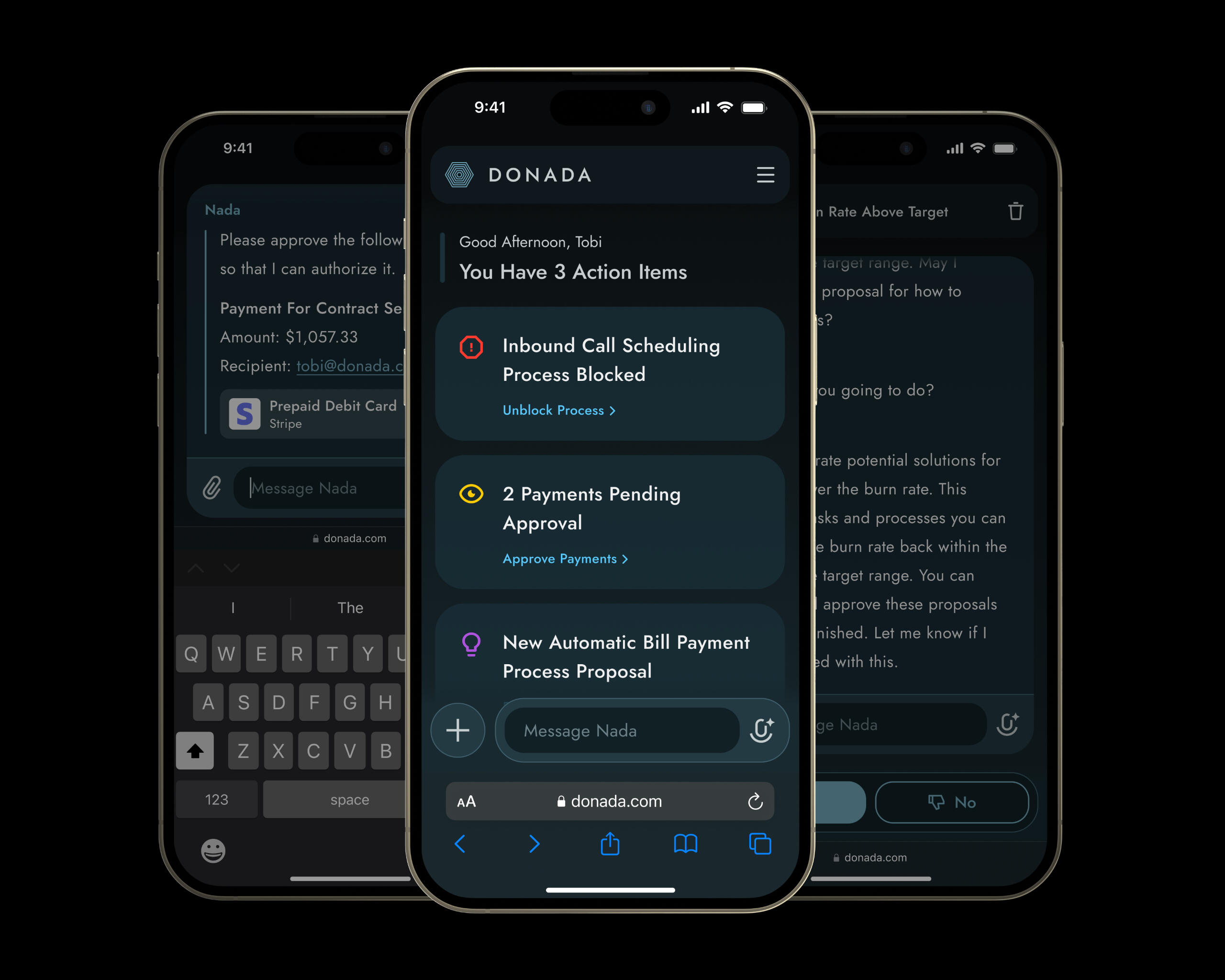
BackgroundOver 60% of small business owners are overwhelmed by the admin work they have to do in order to keep things running. Admin tasks are especially painful for owner-operators who lack “computer time” because their work day consists of driving between job sites and meeting customers face-to-face. Donada's AI agent can help SMB owners get more done on the go, by performing tasks and automating multi-step processes on their user’s behalf.
ProblemUnlike enterprise, SaaS never ate the small business market. That’s because traditional business management software requires much training to adopt, and it’s time-consuming to use. To succeed in SMB, Donada must be intuitive and proactive — that is, it should reduce the time and cognitive load associated with running a 10-50 person business.
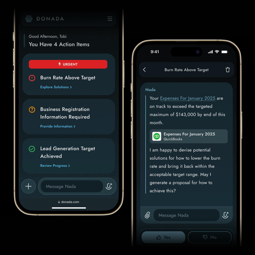
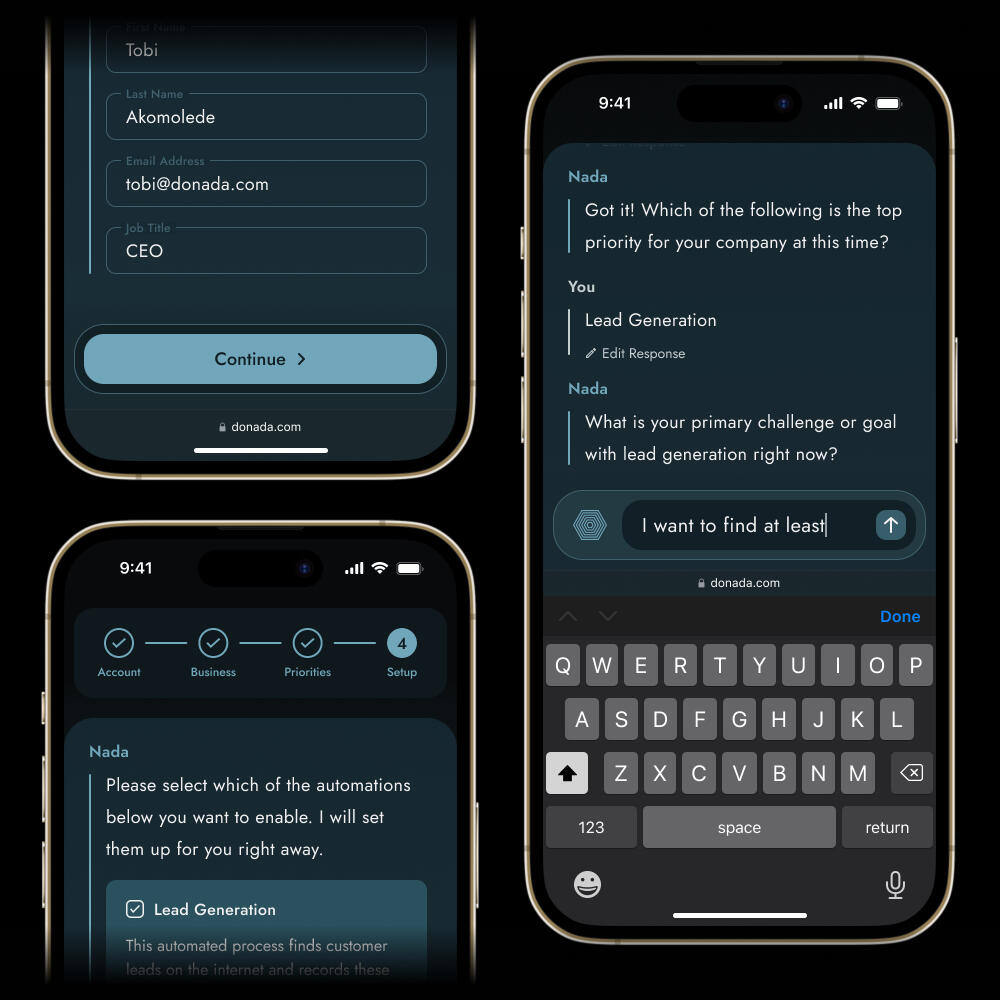
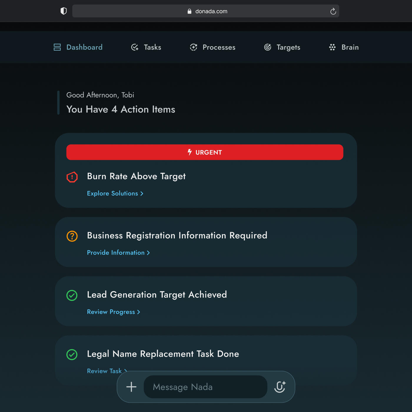
Design ProcessFor the early iterations of Donada, we prioritized boomer-friendly onboarding, as well as a suggestion-driven UX orchestrated by the AI agent at the heart of the product.The best affordance for the onboarding flow was a Conversational UI: a guided chat strikes the balance between easy-to-understand and extendable enough to accommodate a wide range of outcomes.To prevent overwhelm and confusion, we constrained the user to a limited number of response types: text, single-select, and multiple-select. The CUI provided the appropriate input form for each question asked by the AI agent throughout onboarding. The agent’s objective was to understand the user’s need so that it could suggest a slate of automations to start out with.A "proactive" UX served as Donada’s competitive differentiator. The product learns the user’s intent (like lead generation), collaborates with them in setting criteria for success (sourcing 100 new leads), and then strives towards them (searching the internet and third-party directories for leads that match the user’s ICP).In short, the AI agent emulates the initiative and self-unblocking skills of a human business manager who's just joining a new team.
Desktop Dashboard View
Desktop Onboarding View
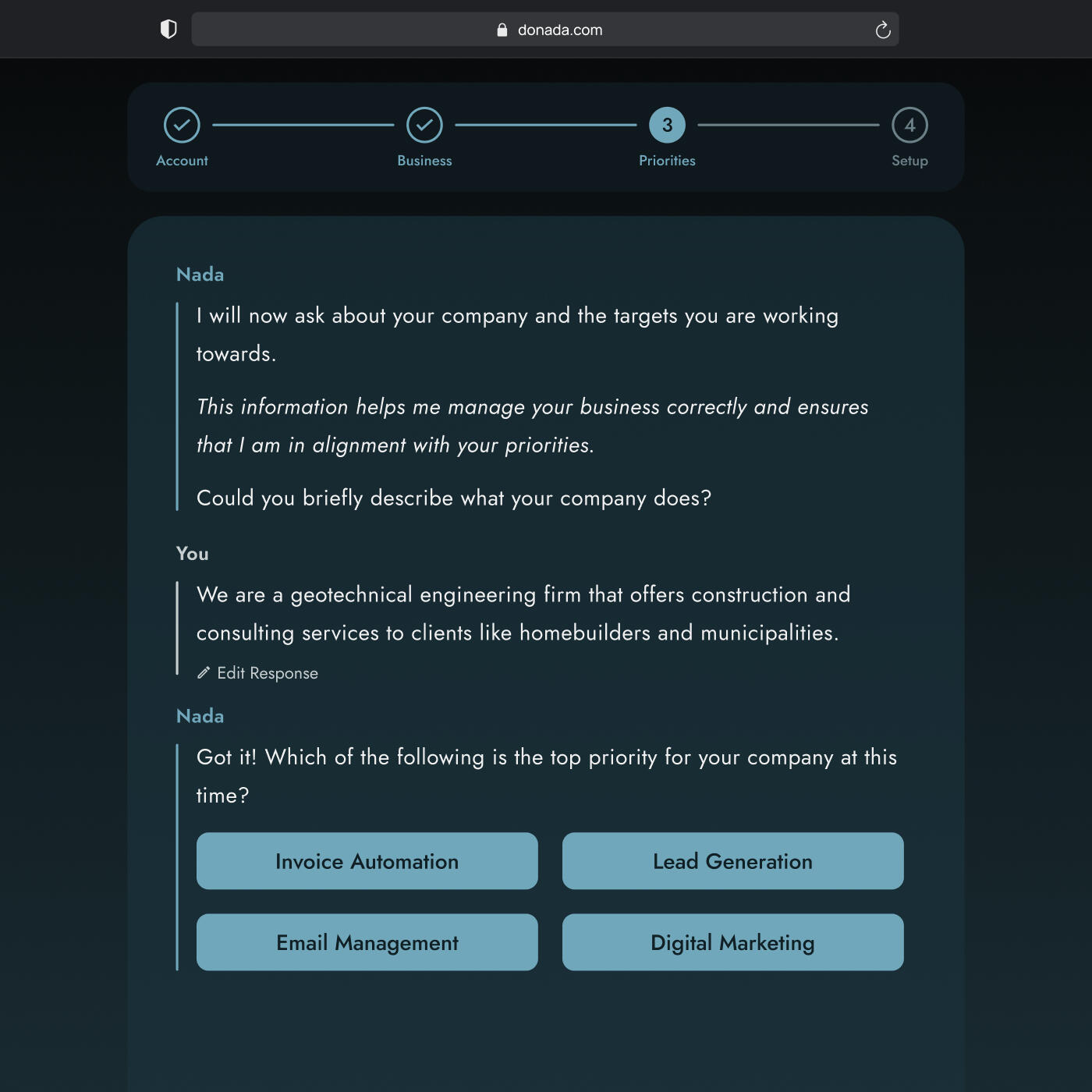

SolutionUltimately, the Donada web app contained a business management AI agent dubbed Nada, which took user direction from the CUI and dynamic input fields. The app served as a GUI to constrain and guide users, so they could utilize the underlying AI agent's power within in a familiar yet extendable form-factor.
LearningsThe sheer scope of a generalized business management AI made maintain a self-serve onboarding funnel problematic. User needs and expectations varied too greatly by industry. I believe that a better approach would have been to constrain our initial feature set and product marketing to a narrower ICP; focusing on vertical-specific distribution.
An Azmain Abrer Project
Made With ♡ in Canada
Inspired by Apple in California
An Azmain Abrer Project
Made With ♡ in Canada
Inspired by Apple in California
Low-Battery Countdown for Dynamic Island
Summer 2023 • UI/UX Design, Motion Design, Sound Design
BackgroundCellphones often die at inconvenient times; be it during a binge of Suits or before someone's hailed their ride home from the bar. This feature concept seeks to minimize exactly that inconvenience in Dynamic Island-supported iPhones leveraging the Live Activity affordances provided by iOS 16 and later versions.
ProblemThere is no warning pushed to users immediately before their device battery runs out. The 20% and 10% battery remaining system alerts, while helpful in most cases, are insufficient for the edge cases during which the user relies on their device battery well into its final decile.
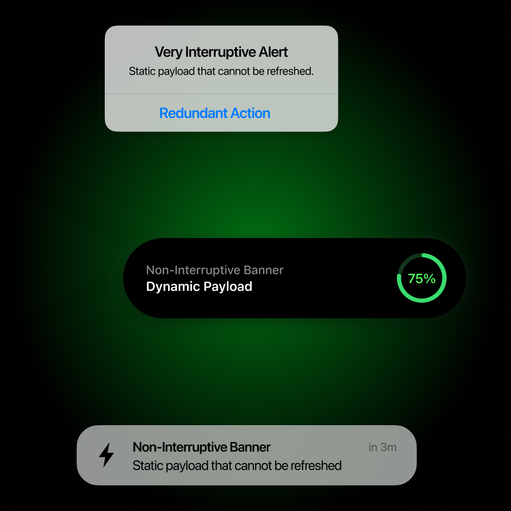
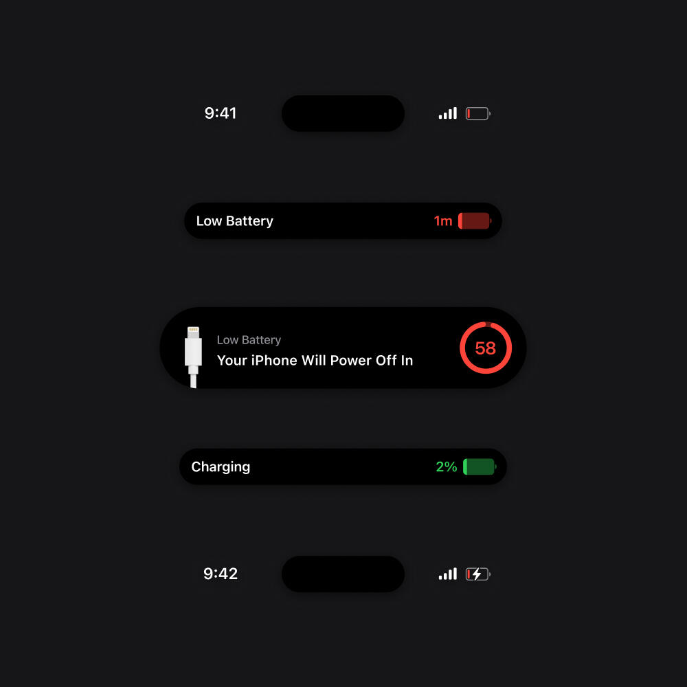
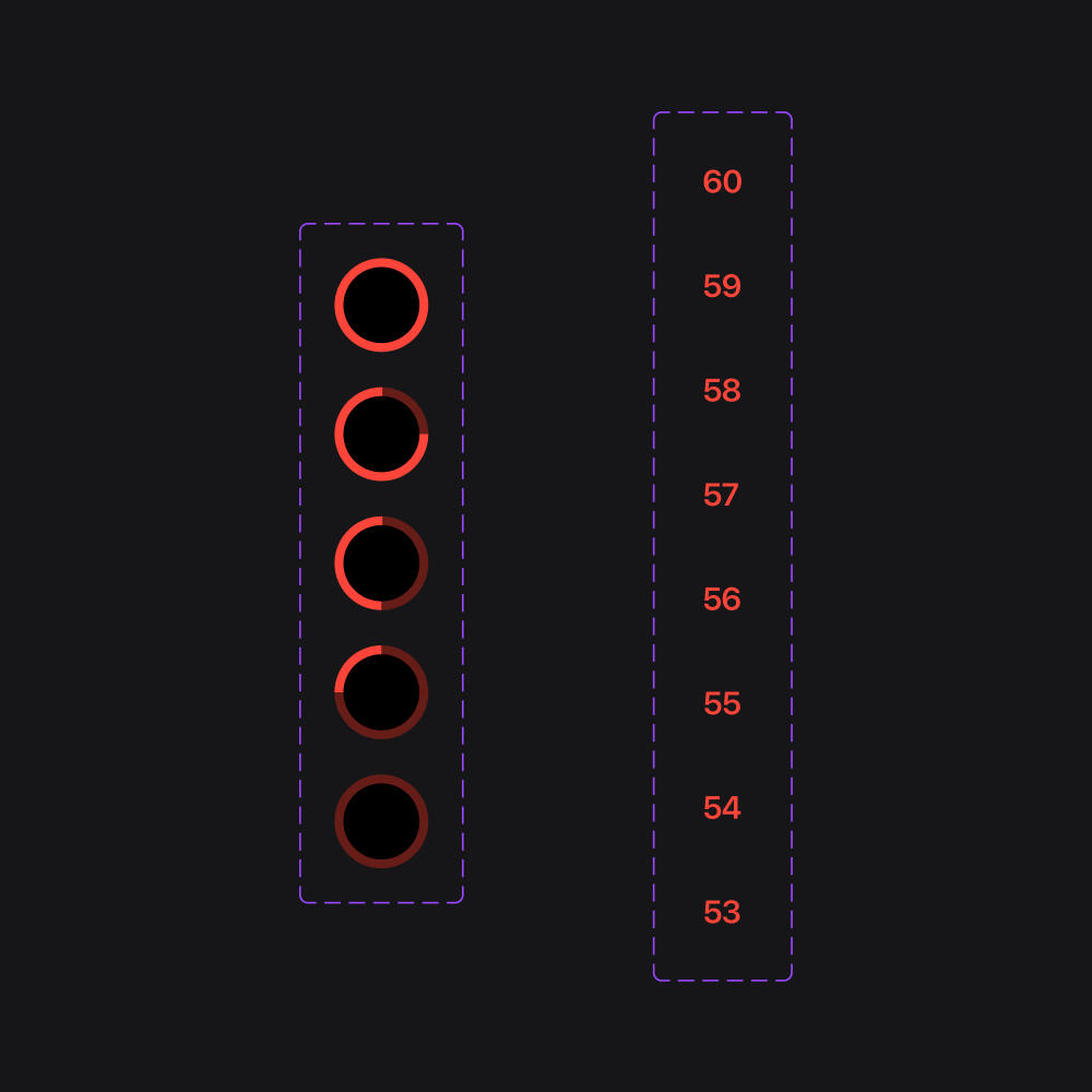
Design ProcessAn initial exploration of Apple's technical docs for system activity monitoring and guidelines for information architecture yielded two supported mechanisms that I could leverage. Either an interruptive system alert, or a non-interruptive banner notification. Since an end-of-battery-life user might be doing something urgent on their phone, I opted for the latter. Conventional banner notifications, however, are limited to displaying static payloads. I wanted the user to receive a dynamic payload that warns them exactly how long they have until their device powers off. Hence, I settled on a countdown design implemented as a Live Activity on Dynamic Island-enabled devices. I then proceeded to create a layout grid to ensure that no content within the Dynamic Island component would get clipped by the sensor region. Finally, I prototyped and animated the feature, adding the low-battery and connected-to-power sounds that I modified from Apple's library to better synchronize with my motion design.
Dynamic Island Animation Sequence
Animated Countdown Variants
SolutionThe end result is an iOS 16 and onward-supported, animated system alert that prompts the user to either plug in their phone imminently, or make the best use of their device's final 60 seconds of battery life. This feature can be engineered in SwiftUI on Dynamic Island-enabled iPhones.
LearningsAs this was my first time working with Live Activities, there are some UI details that I missed in retrospect. One of them being the background blur applied underneath the Dynamic Island alert's drop shadow, such that its XLarge and Ultra Large variants appear on a different visual plane.
An Azmain Abrer Project
Made With ♡ in Canada
Inspired by Apple in California
An Azmain Abrer Project
Made With ♡ in Canada
Inspired by Apple in California
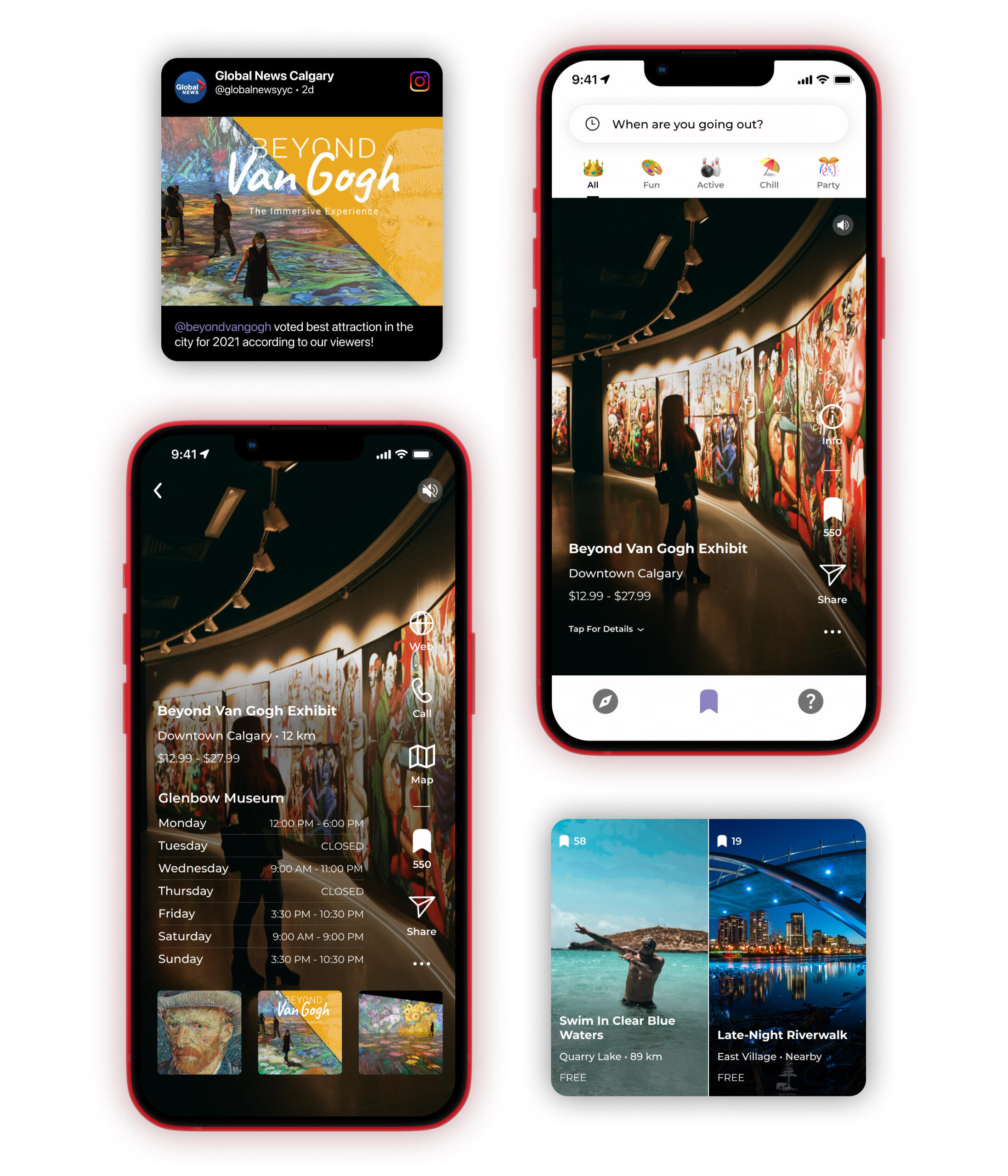
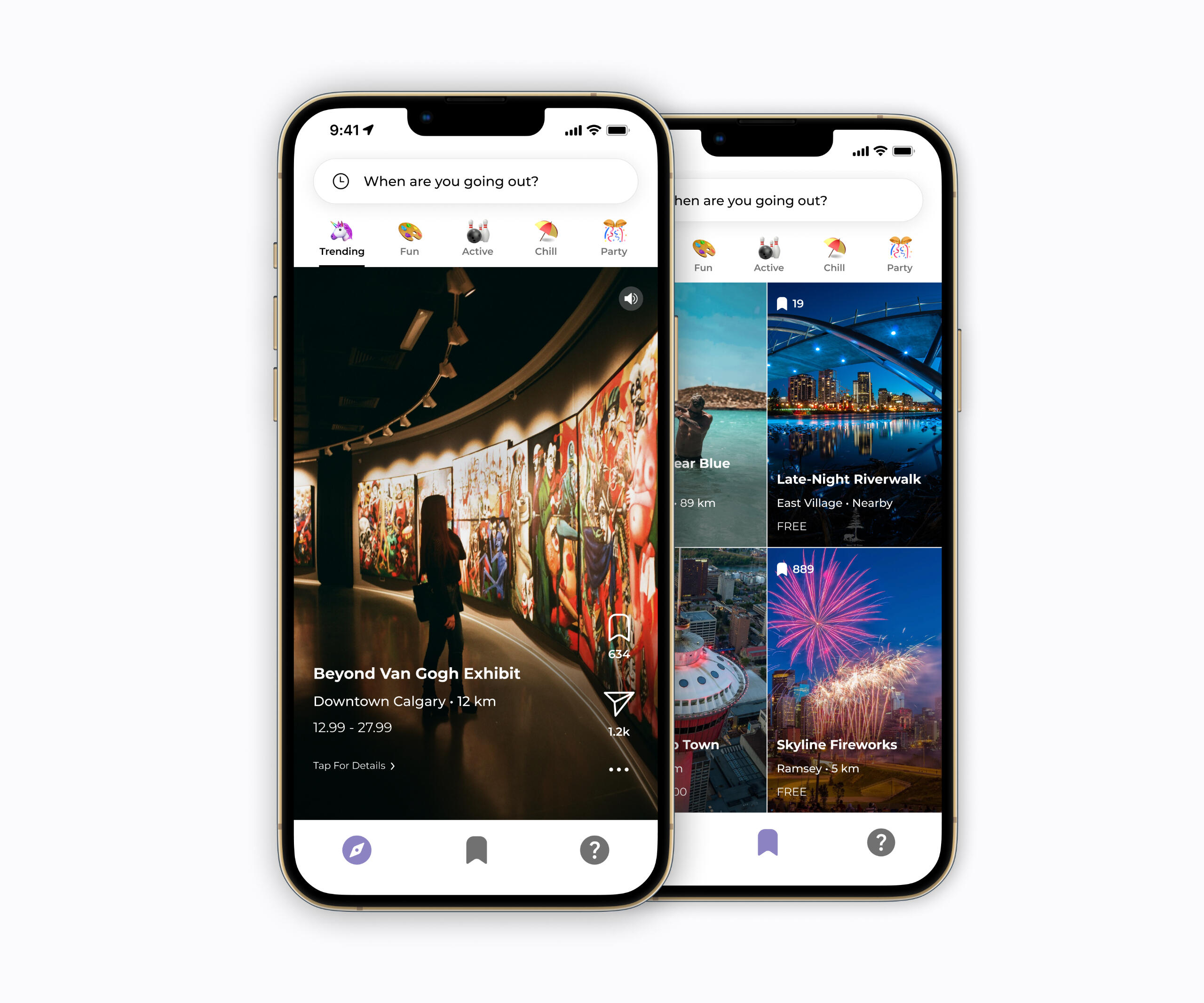
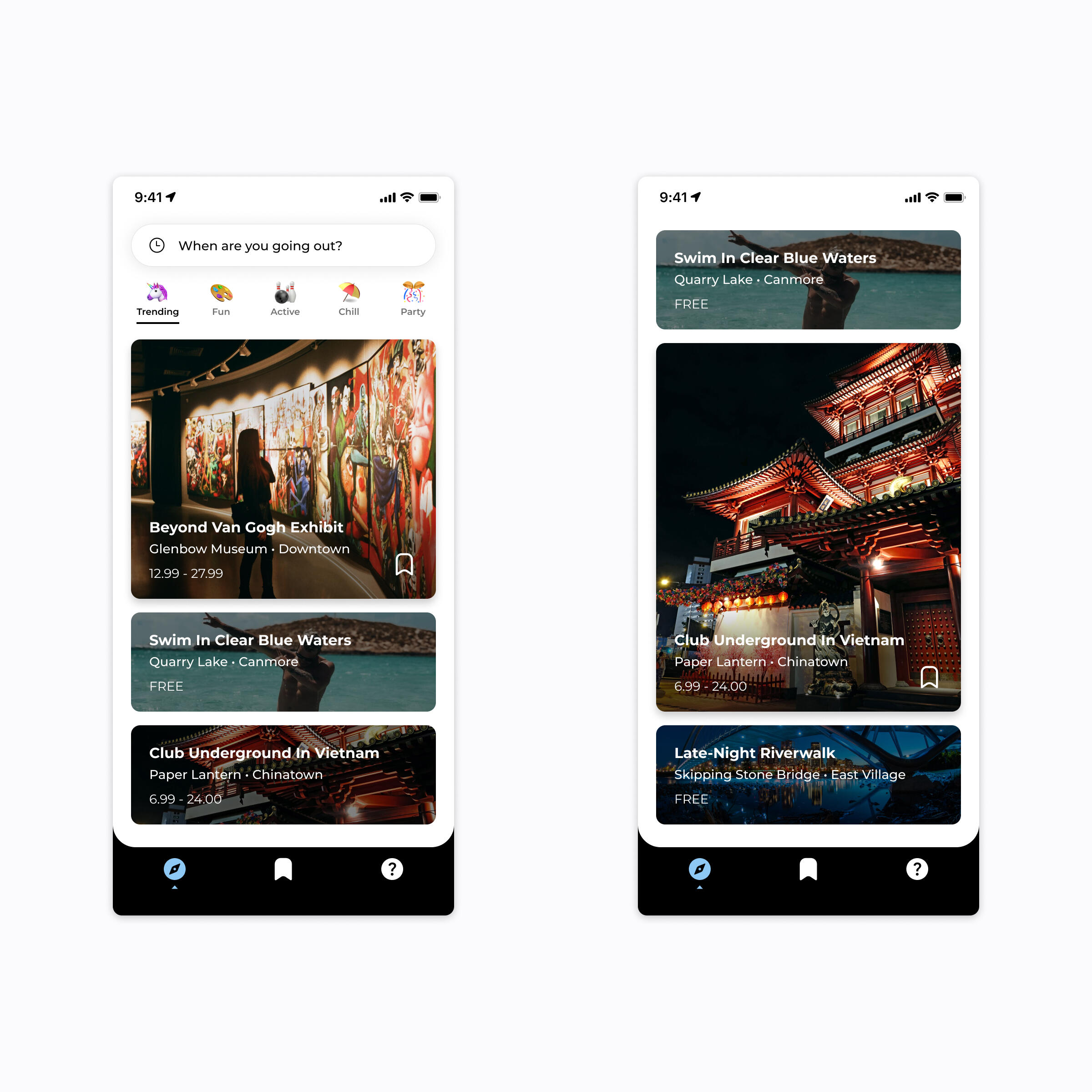
App for Finding Things to Do With Friends
Summer 2021 – Fall 2022 • UI/UX Design, Content Design, Product Marketing Management
BackgroundSettling on a place to hang out with the friend group takes far more work than it should. Despite all that time spent pinching and zooming through Maps, people somehow always end up hitting the same three places they usually frequent. So, post-pandemic lockdowns, I co-founded a mobile app called company Jikoo to help friend groups make plans IRL. As Chief Product/Design Officer at Jikoo, I worked on all design tasks as an individual contributor, closely collaborating with our Chief Technology Officer to deliver tested, dev-ready prototypes.
ProblemPlanning get togethers is time consuming because activity discovery is a manual search-and-filter process that involves sifting through a lot of information across multiple apps/sites. It's a complex (and sometimes group) effort that requires looking for a nearby venue, comparing alternatives, making a reservation, and sharing location details with attendees.
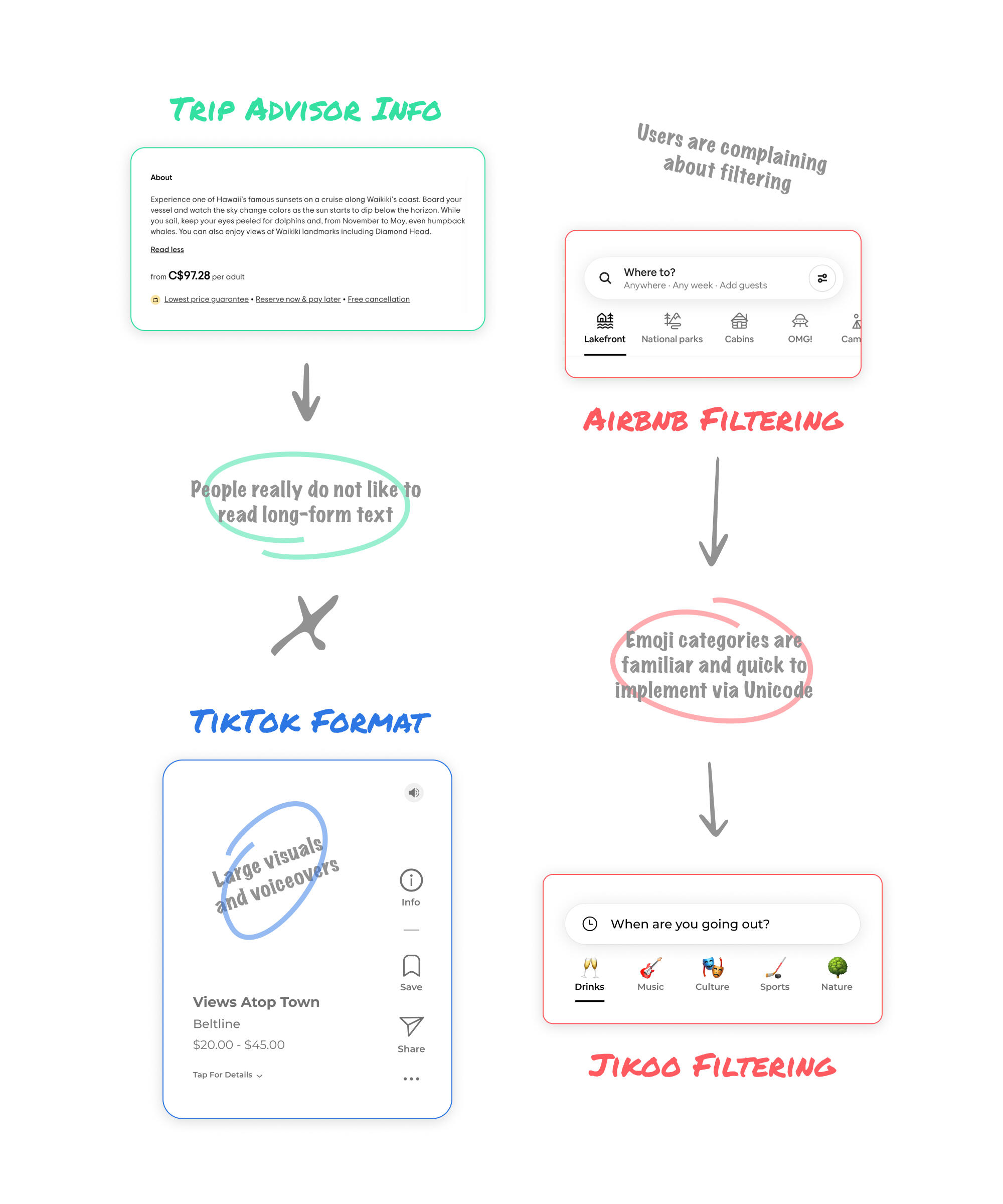
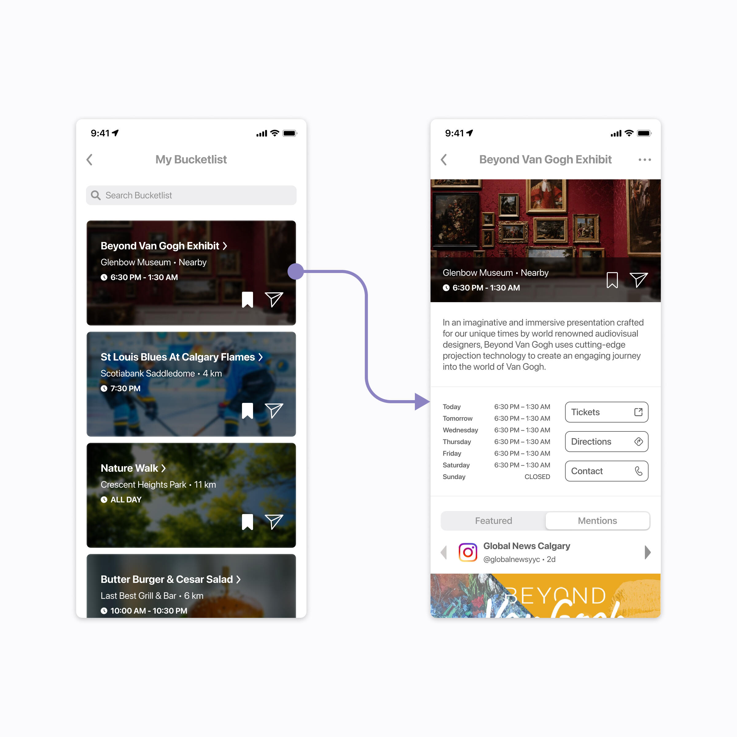
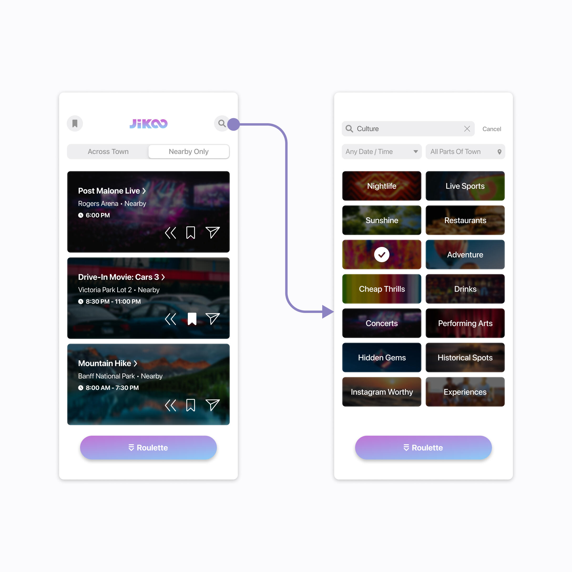
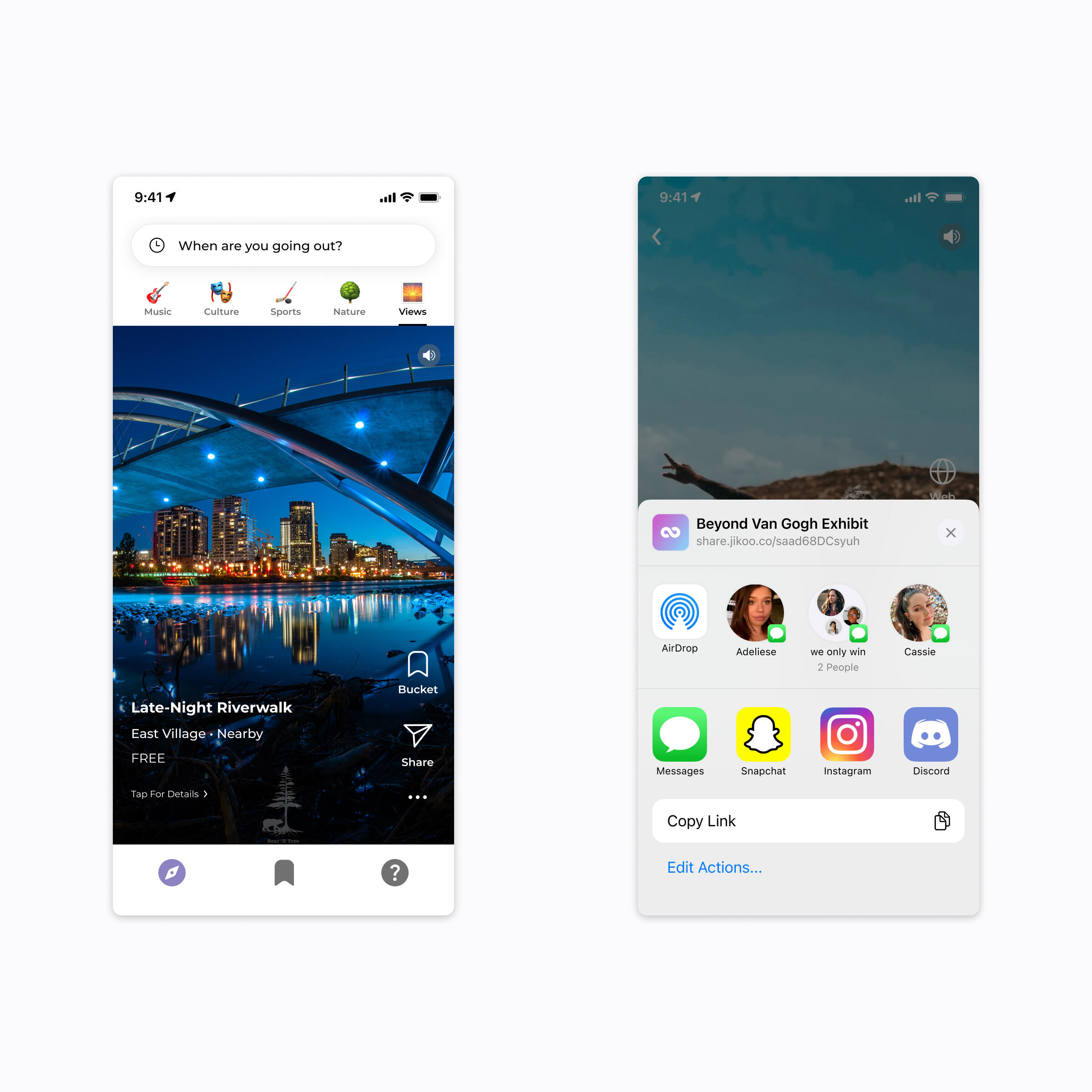
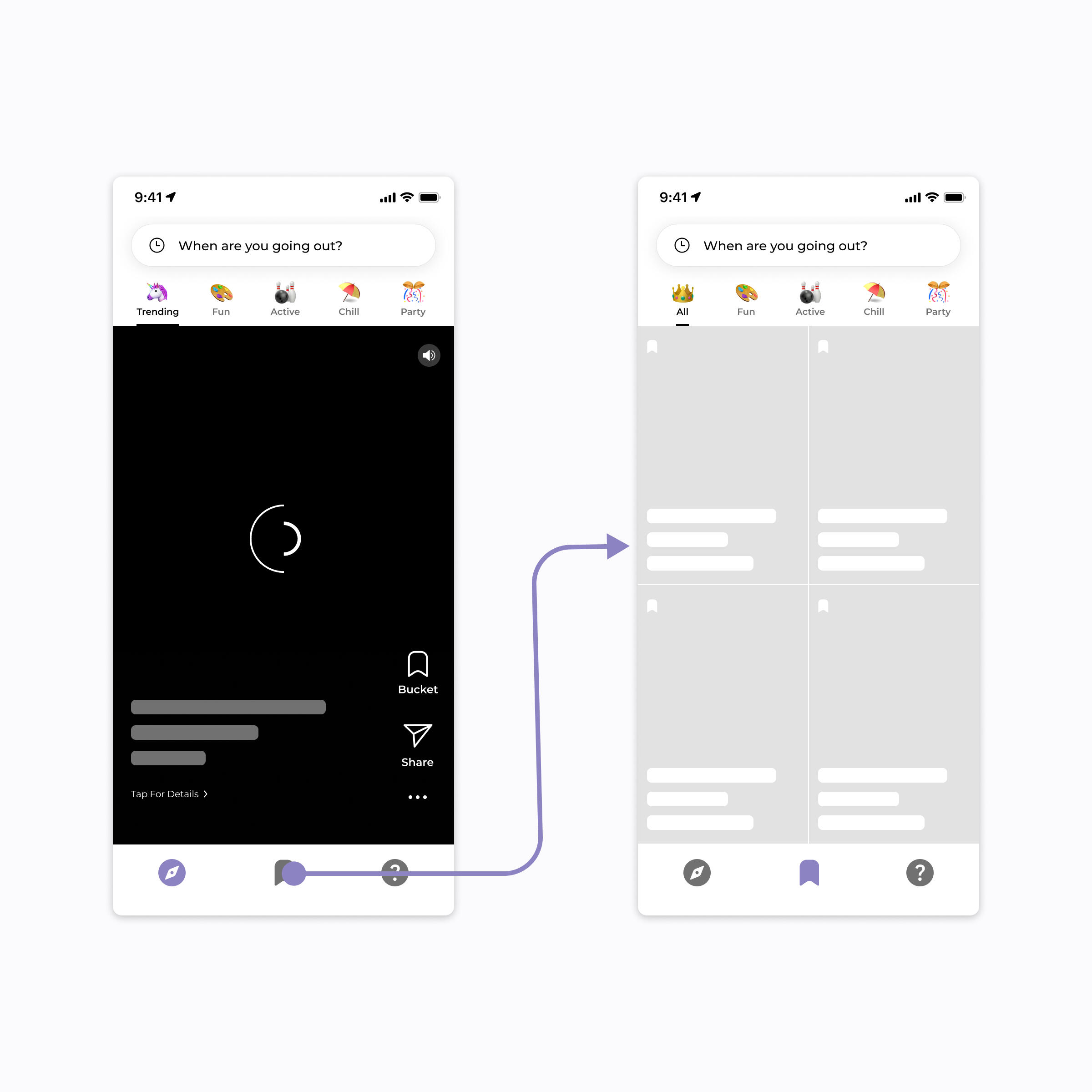
Design ProcessI designed Jikoo from first principles by following a tight Observe, Hypothesize, Build, and Test loop. I did this by validating each iteration through in-person conversations with, and session recordings from, TestFlight beta users.The minimum-viable-product for Jikoo was inspired by enduring apps like Trip Advisor and Airbnb, which historically solved the discovery problem for their respective use cases. Thus, they served as a reliable starting point. The rest of the early UI/UX for Jikoo was borne from my intuition about how I would (probably) use the app; thereby yielding a considerable emphasis on localized recommendations, abundant venue images, and detailed text descriptions.Once launched, our Amplitude analytics revealed that people don't like to read much, so I pivoted the app's core medium to short-form vertical video instead. As such, the text descriptions were transformed into voiceovers; and still images and open hours were moved into a modal. More functionality, such as filtering recommendations by emoji vibe and saving them for later, was added after several users complained to me about it. I also made further aesthetic improvements, like skeleton loading frames and custom spinner animations that replaced the default React Native elements implemented in earlier versions.
0th Starting Iteration
1st Random "Roulette" Iteration
2nd Video Card Iteration
3rd Fullscreen Video Iteration
Skeleton Loading Frames
Desktop Web View
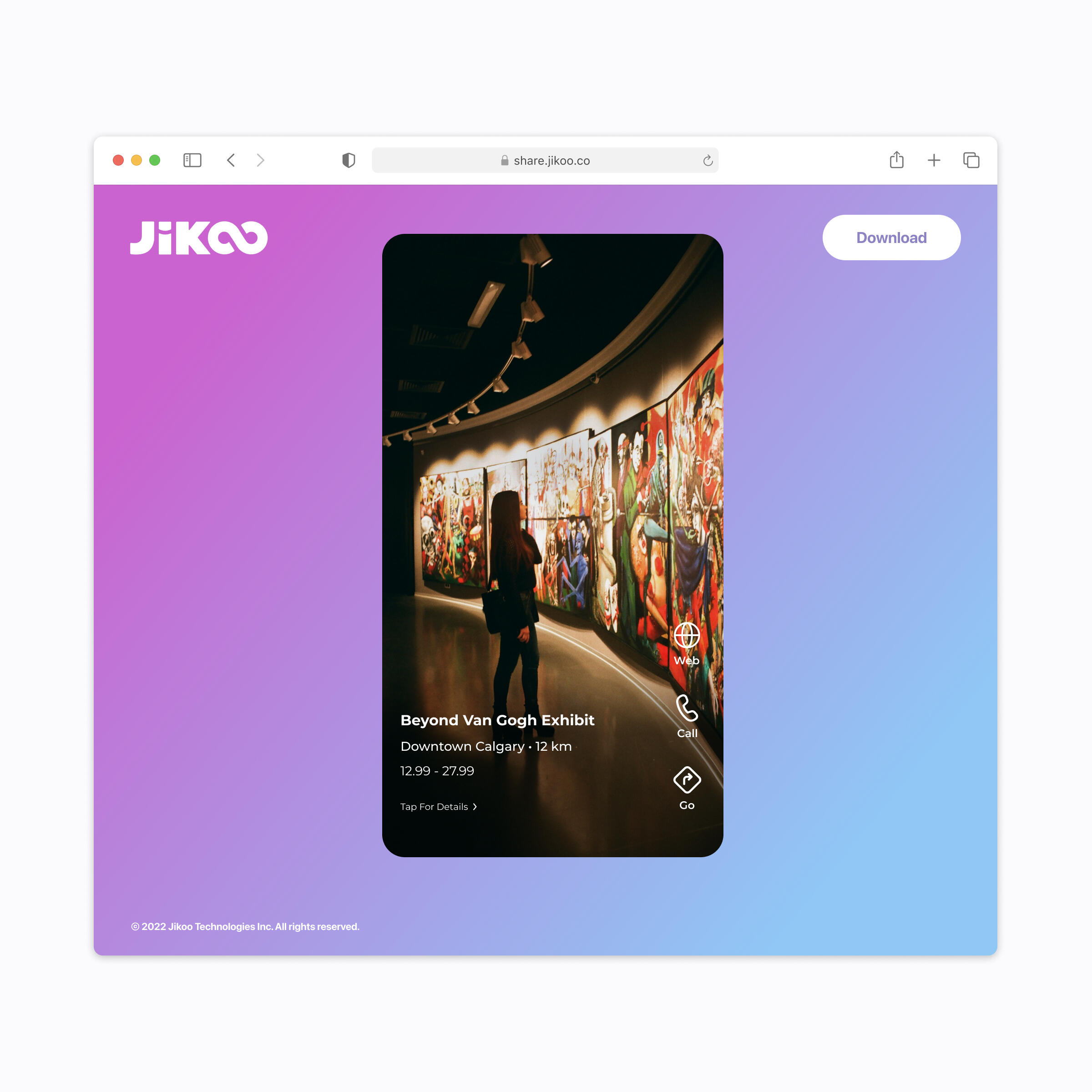
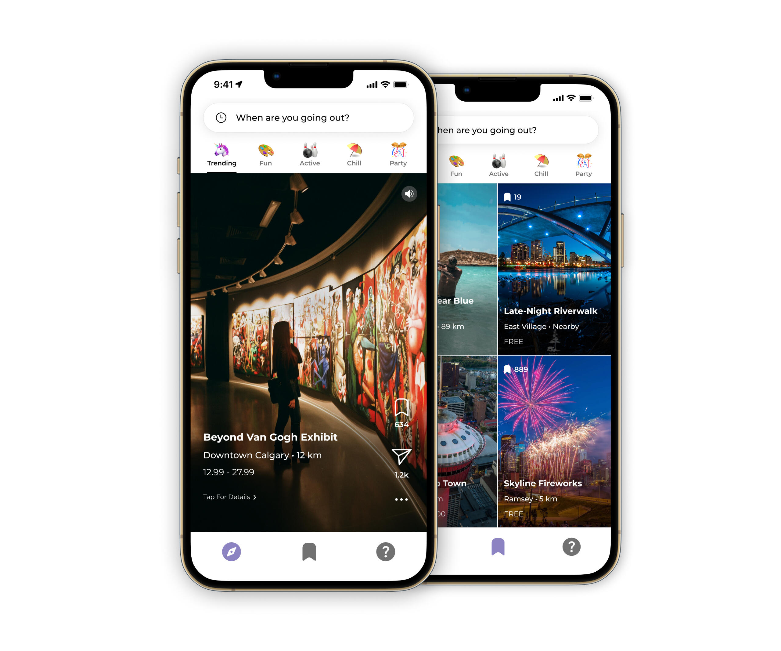
SolutionAt the end of three product iterations, what resulted is a TikTok-style app for local activity discovery supported on Android, iOS, and Web. With it, users can find fun things to do nearby, check an activity's open hours/social mentions, and buy tickets or make reservations directly within the app.
ReflectionIn hindsight, I'd apply a darker tint to the More Details modal to increase the legibility of its contents. I would also opt for simpler marketing assets so my video thumbnails aren't as busy. (Shoutout to my friend Maggie for pointing these out!)
An Azmain Abrer Project
Made With ♡ in Canada
Inspired by Apple in California
An Azmain Abrer Project
Made With ♡ in Canada
Inspired by Apple in California
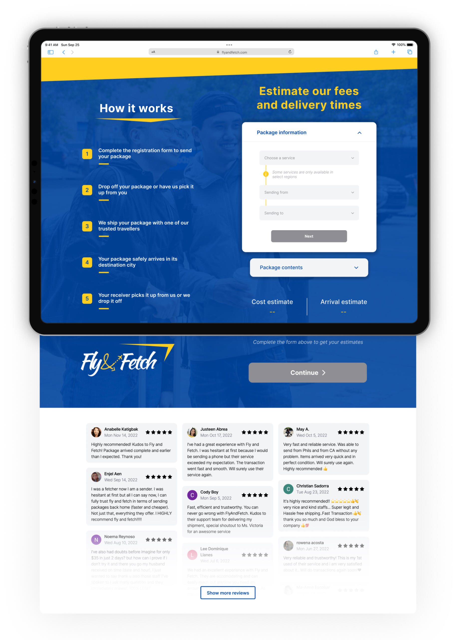
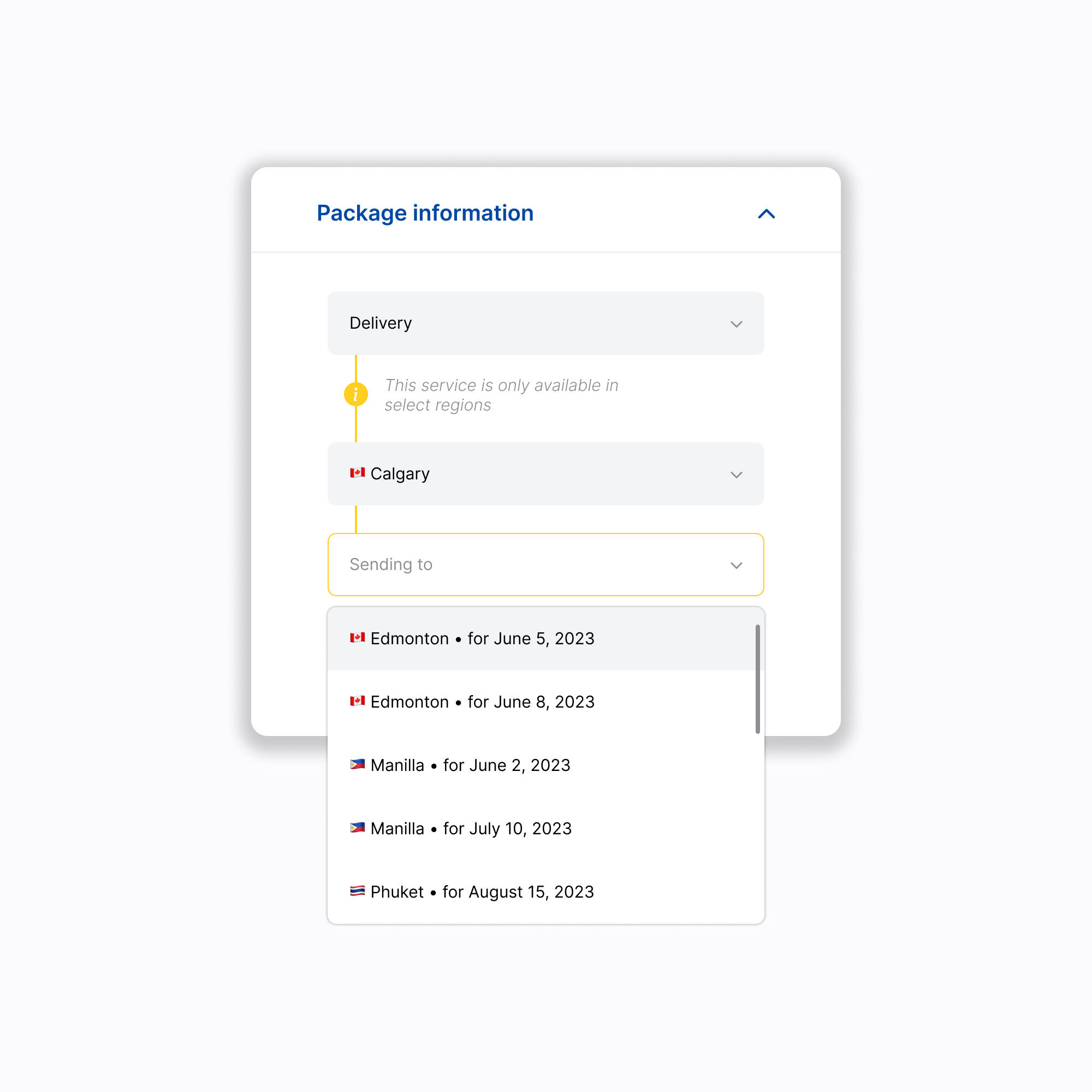
International Crowd-Shipping Platform
Fall 2022 – Spring 2023 • UI/UX Design, Design Program Management, Product Management
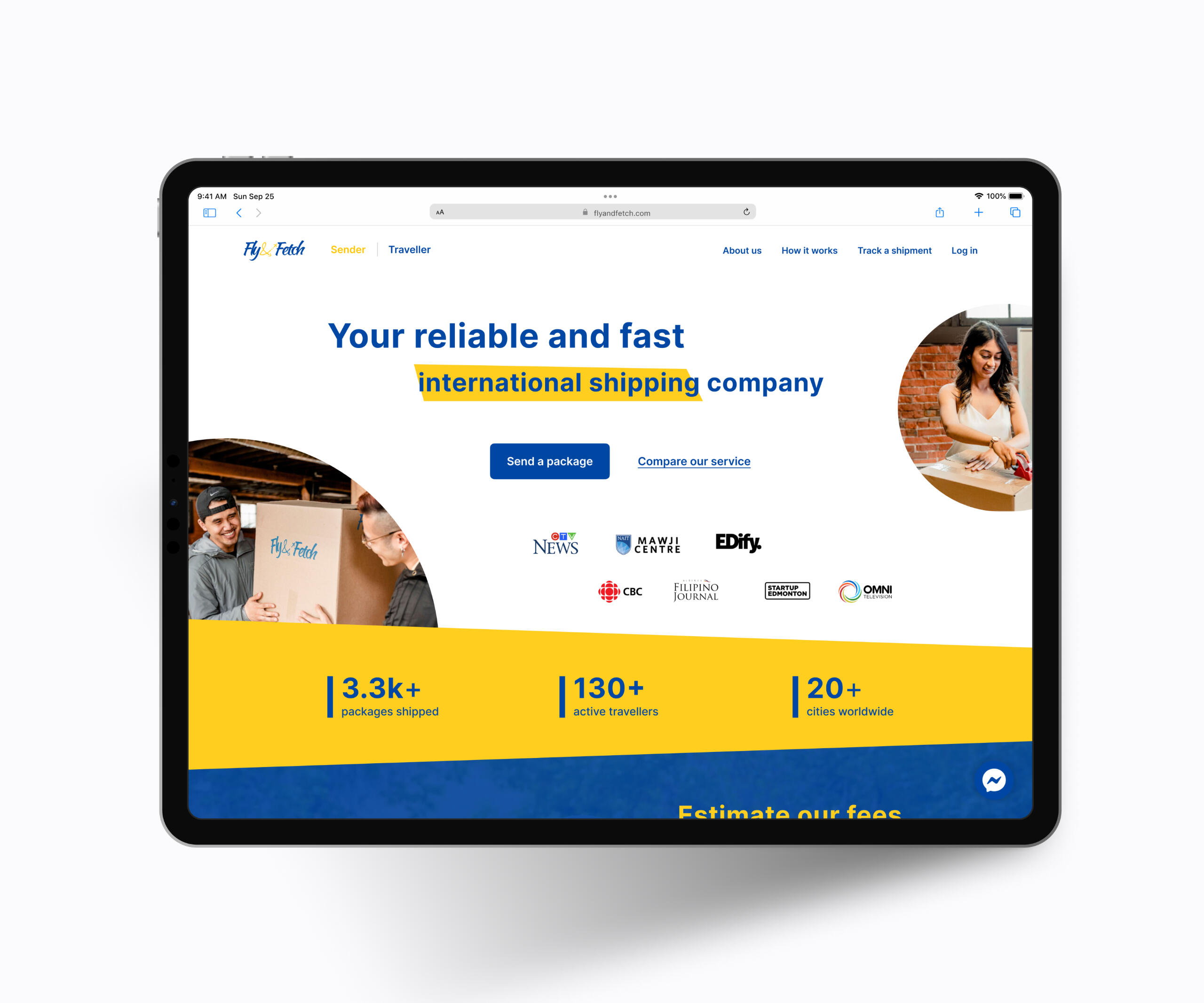
BackgroundOverseas shipping for small items like cell phones and local delicacies is prohibitively expensive via traditional couriers. That's why first-generation immigrants task friends and relatives who are travelling back home to take such items with them instead. Fly & Fetch is an online service that productizes this, enabling anyone to send packages with friendly air travellers for a fraction of the price. Travellers who lease their check-in baggage allocation to Fly & Fetch senders receive a 50% to 100% rebate on their flight, while the company handles security screenings, insurance, and customs declarations on their behalf. As Head of Product, I was tasked with replacing Fly & Fetch's spreadsheet-based operations with an intuitive, reliable web app that their customers could use to ship parcels with peace of mind. This included onboarding and managing a brand new team of designers and engineers to deliver the project.
ProblemDesign and engineer an end-to-end logistics platform for senders and travellers to create, manage, and track shipments. Without disrupting the existing user journey.
Design ProcessI came into this project knowing very little about shipping services, so my preliminary UX research consisted of trying out Fly & Fetch's product and comparing it to established logistics players like FedEx and DHL. This helped me to contextualize the overall design challenge and major friction points from our immigrant user's point of view.Next, I scoped out our key design requirements. I decided on these by interviewing the customer service team about what kind of support requests they received from users. It turned out that people had a lot of questions about our service's pricing model and credibility, thus leading to a disproportionately high top-of-funnel bounce rate. Product analytics, moreover, revealed that over 80% of site visitors were browsing from mobile devices.Leading a team of designers and engineers, I prototyped and tested an accordion-style cost estimator that clearly communicated how our service works using conditional information boxes. I also created the Tailwind CSS-based design system that we used to build the remainder of the mobile-friendly web app.
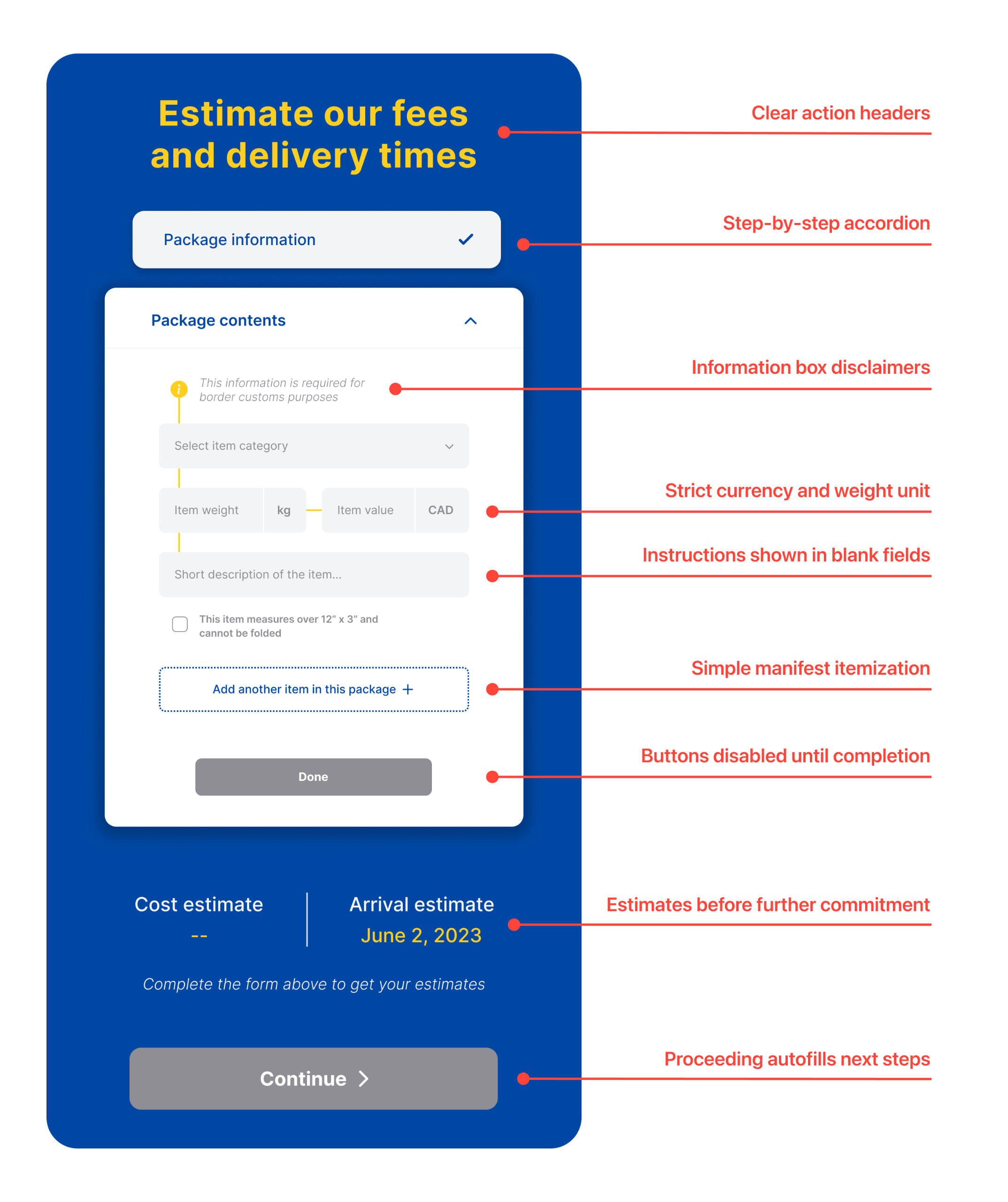
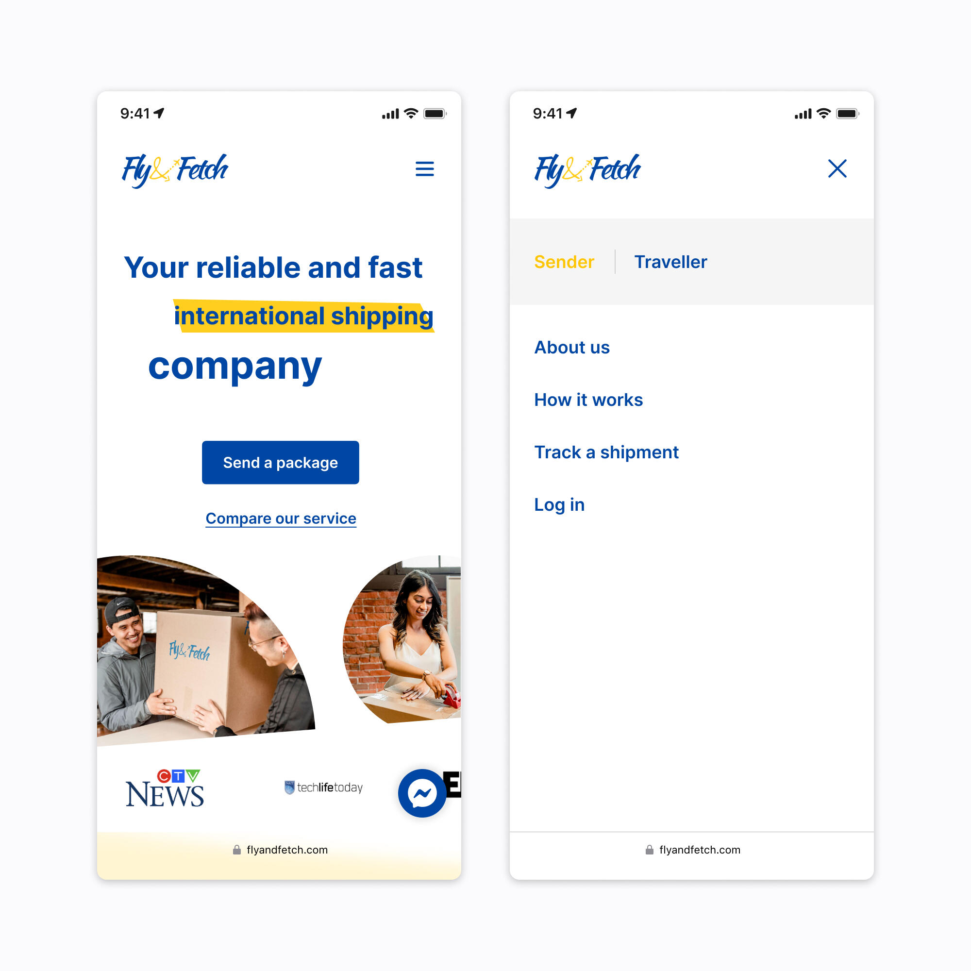
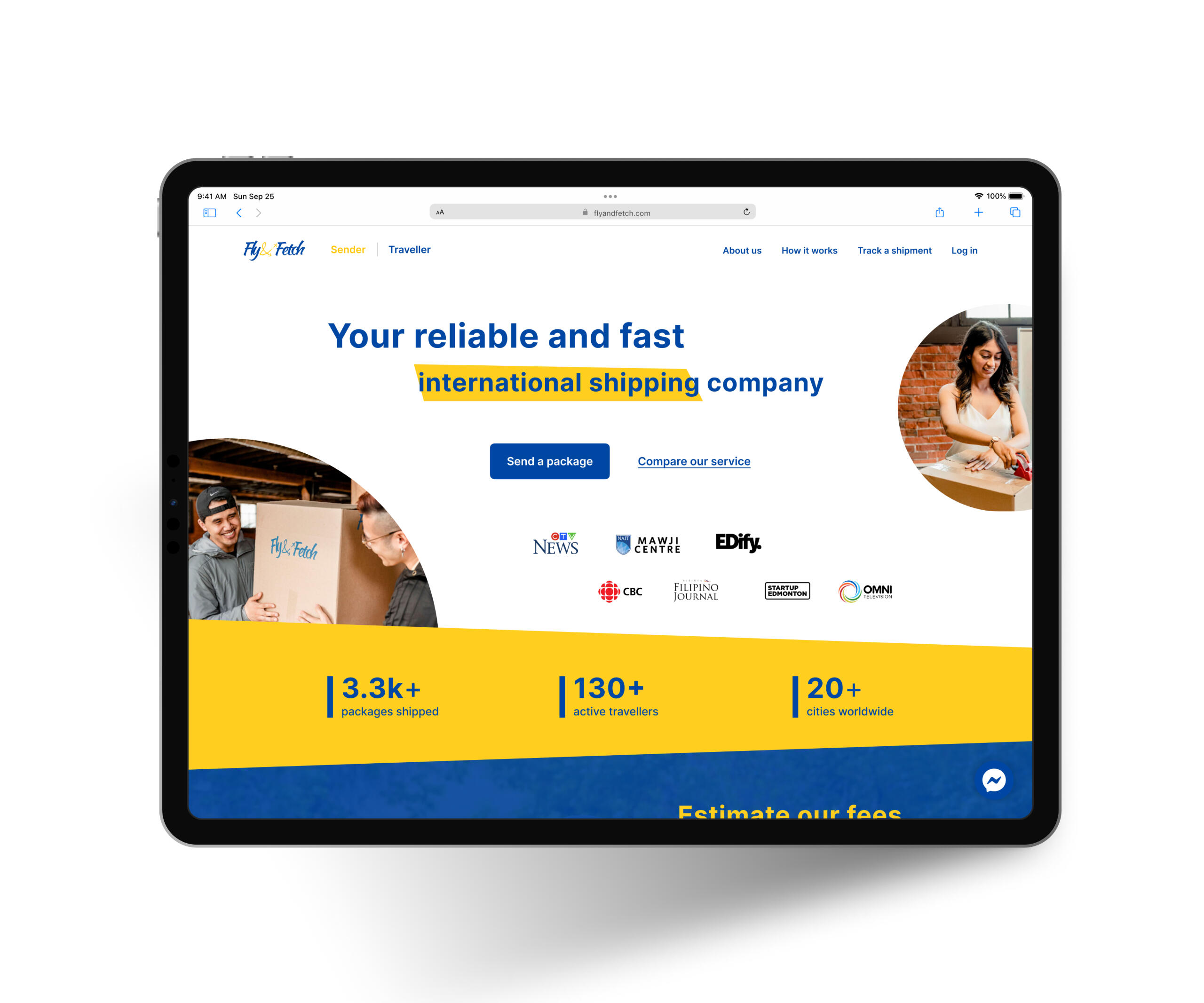
Mobile Landing Page
Mobile Send Package Form
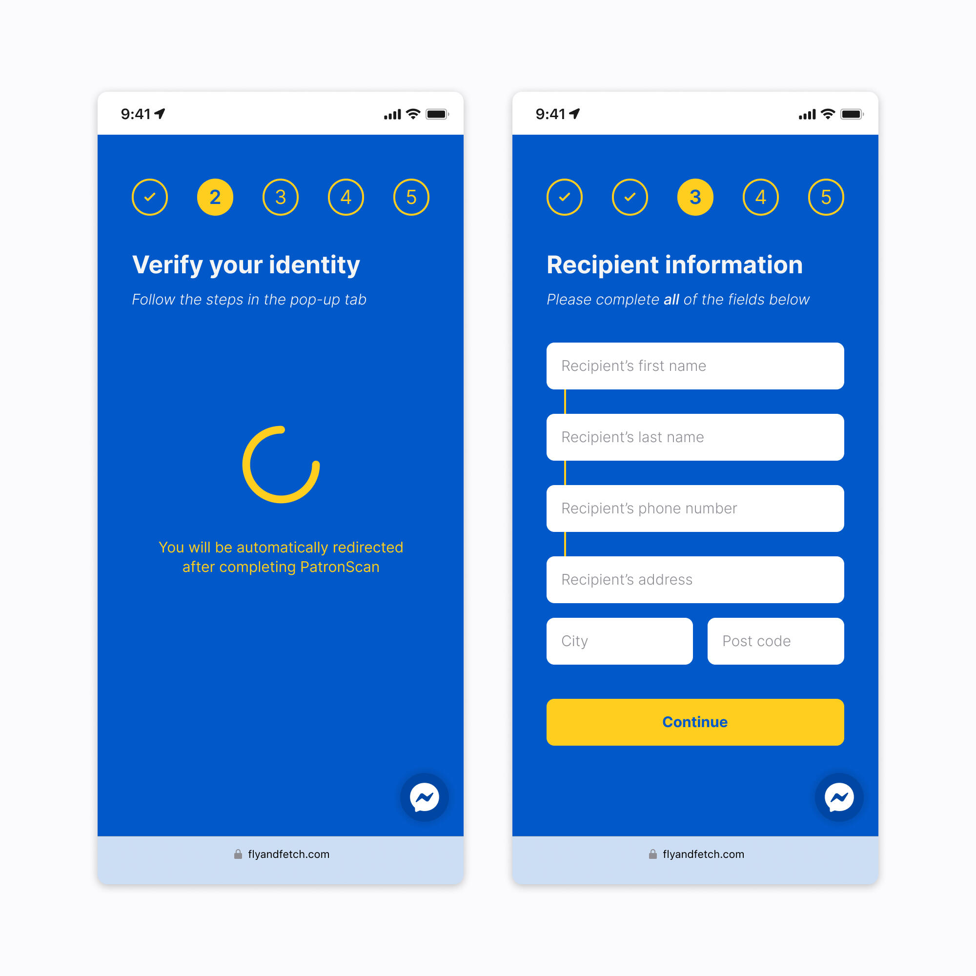
Desktop Send Package Form Alert
Desktop Send Package Form Dropdown
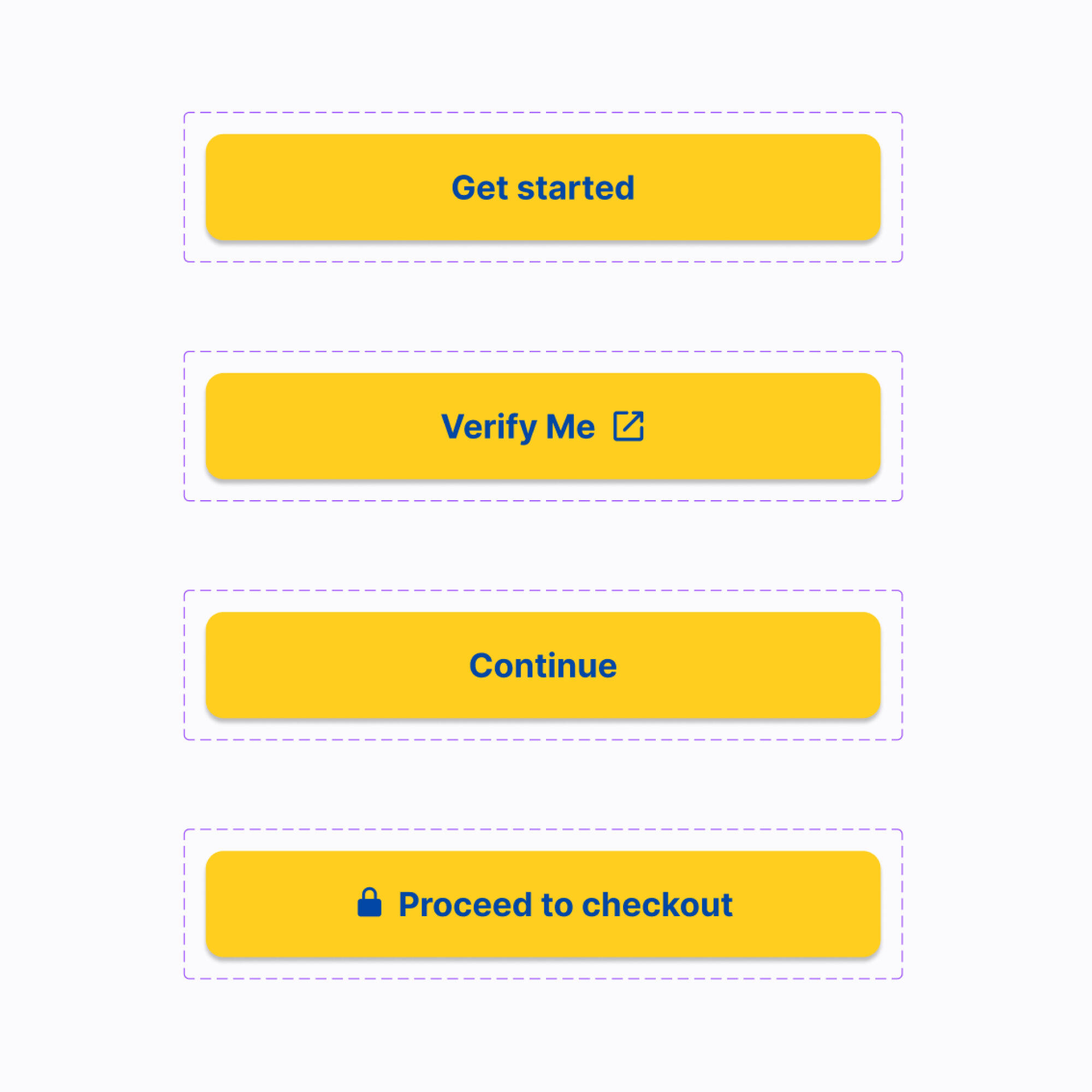
Disabled Button Variants
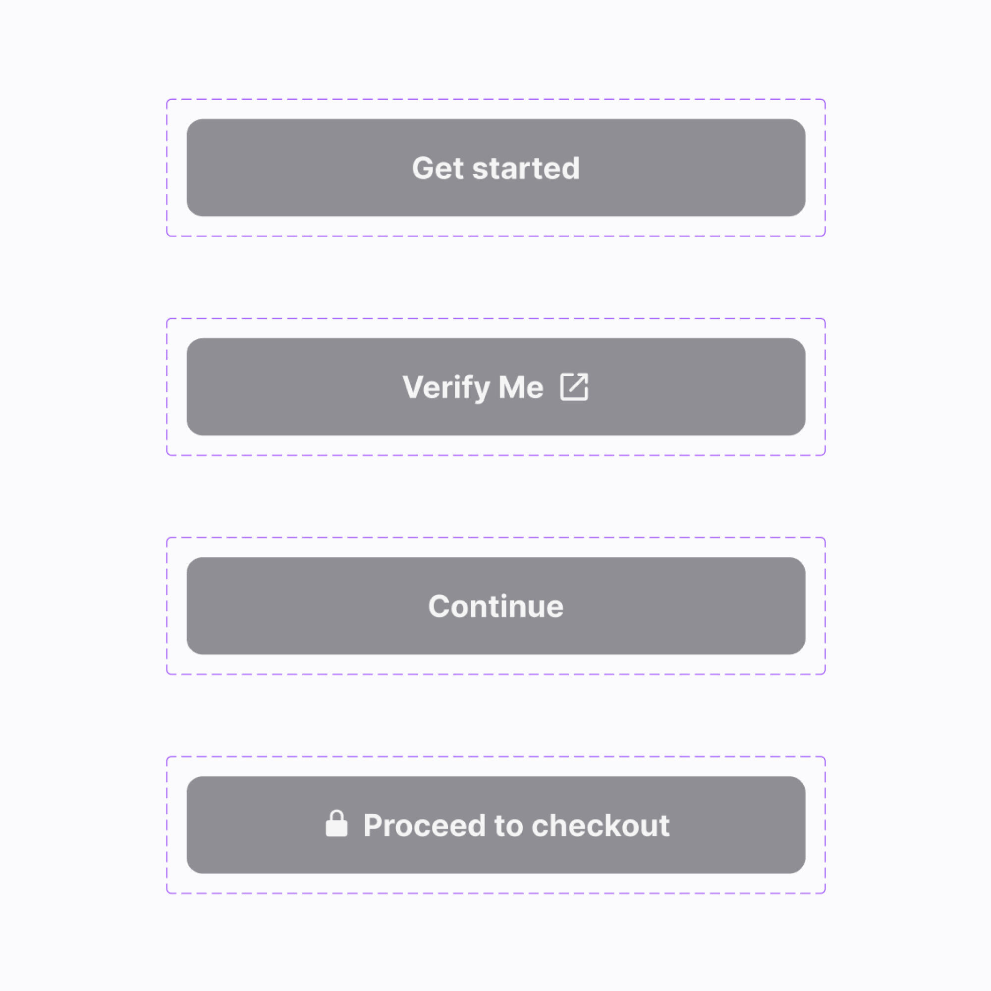
Enabled Button Variants
SolutionThe redesigned product is an easy-to-use and visually accessible web app that emphasizes Fly & Fetch's trustworthy value proposition. Both the cost estimator and Send Package flow successfully addressed the concerns raised by users of the previous site; thereby increasing new visitor conversions.
LearningsIf I had more time than just six months to deliver this entire project, I would have added localization to our roadmap. Adding translation to the product could significantly improve user experience for Fly & Fetch's immigrant customers whose first language is not English.
An Azmain Abrer Project
Made With ♡ in Canada
Inspired by Apple in California
An Azmain Abrer Project
Made With ♡ in Canada
Inspired by Apple in California
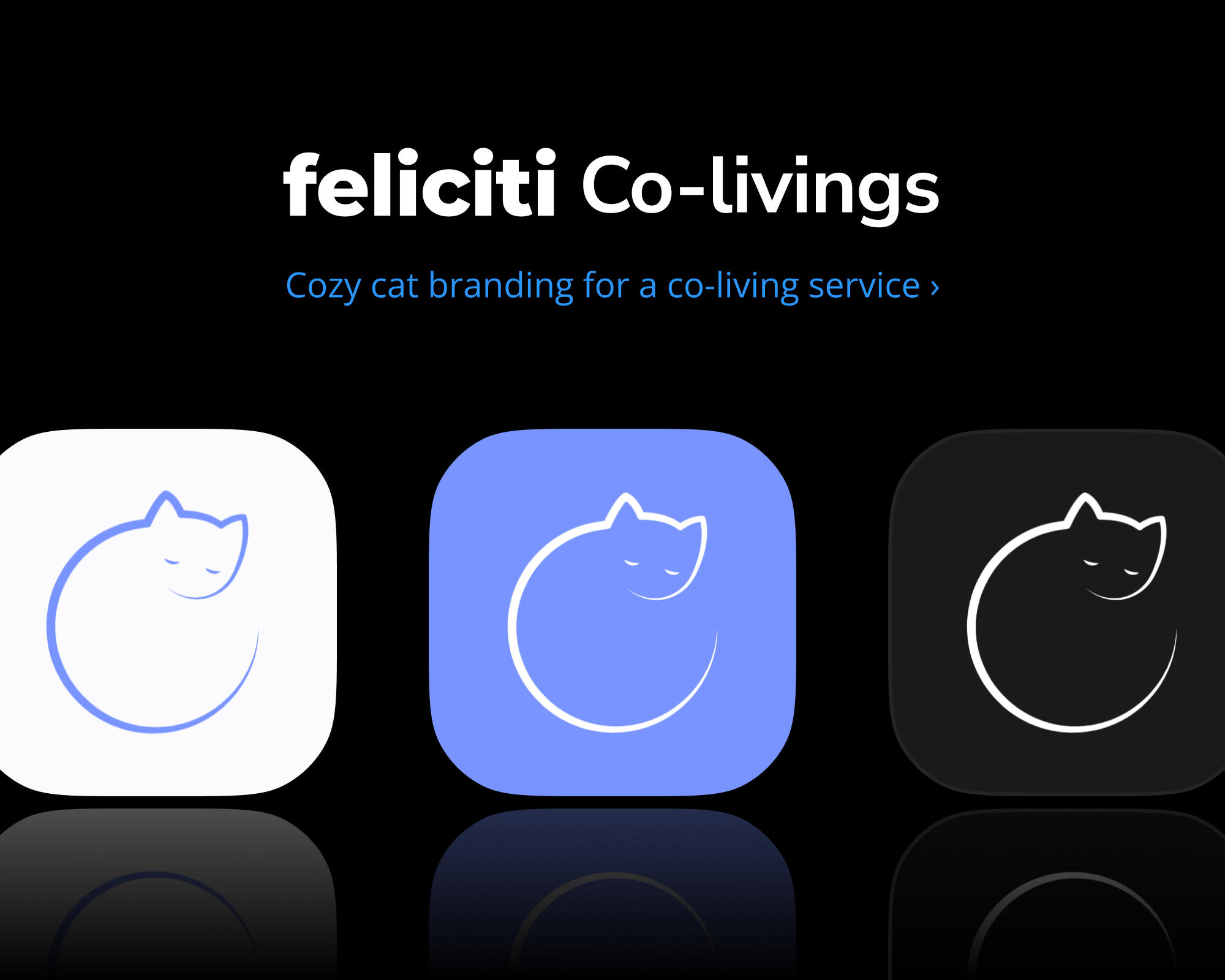
Branding for Feliciti Co-livings
Spring 2023 • Brand Design, Vector Graphic Design
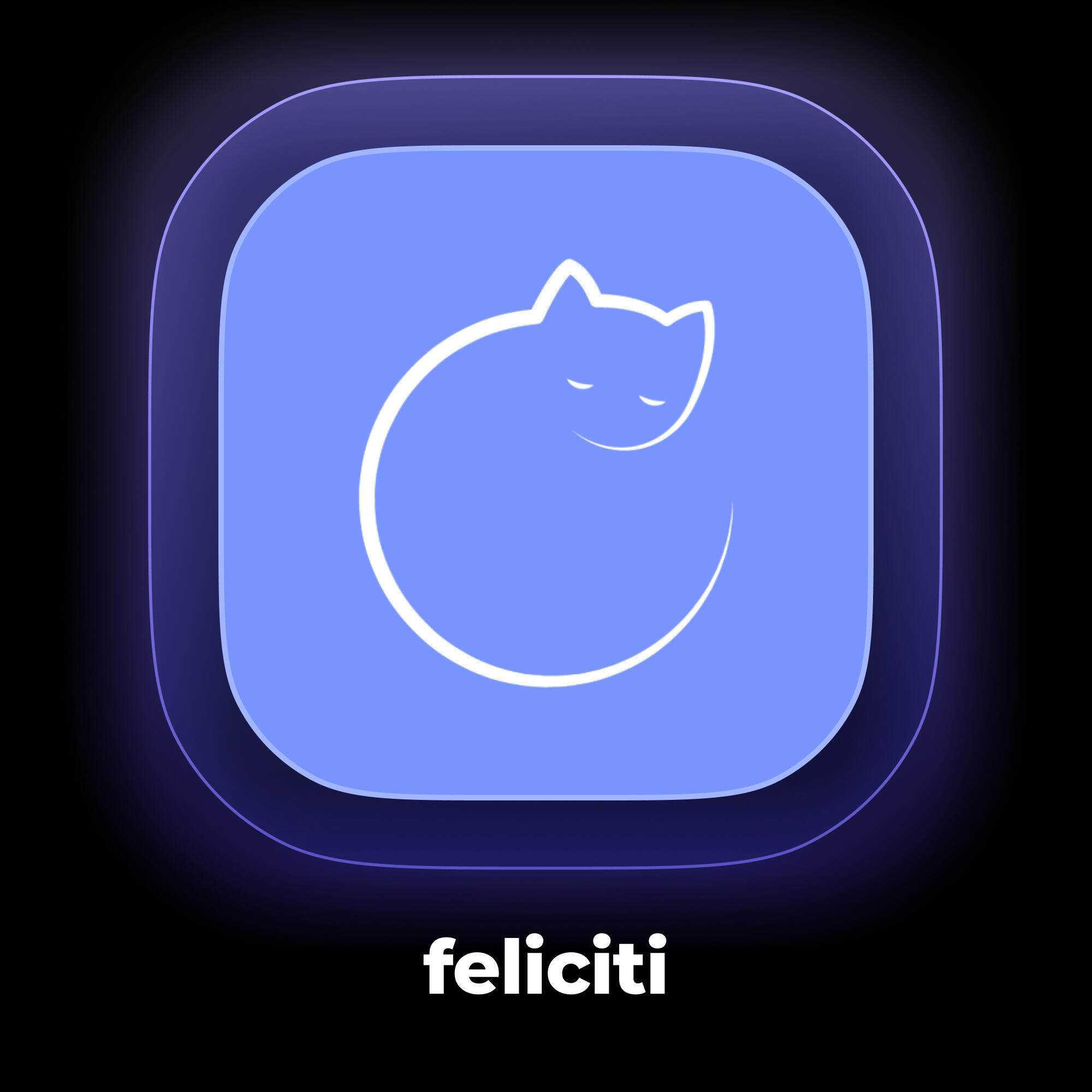
SummaryFeliciti is an online marketplace for people to find and rent with local co-living communities in the Bay Area. I conceived the company's name, app icon, and brand.The word Feliciti is a phonetically euphonious hybridization of the words “feline” and “city” – evoking a comfy and homey image when paired with the company's cozy, curled-up cat mascot of the same name. Feliciti's logo is an iconified representation of that mascot. Its colour palette is based on a low-saturation purple for both light and dark themes. The company’s tone is punny, playful, and communal.
An Azmain Abrer Project
Made With ♡ in Canada
Inspired by Apple in California
An Azmain Abrer Project
Made With ♡ in Canada
Inspired by Apple in California
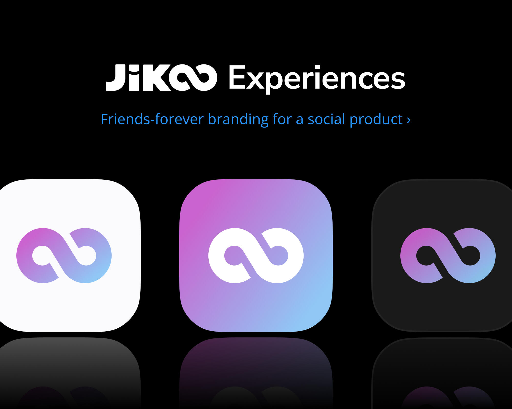
Branding for Jikoo Experiences
Winter 2022 • Brand Design, Vector Graphic Design
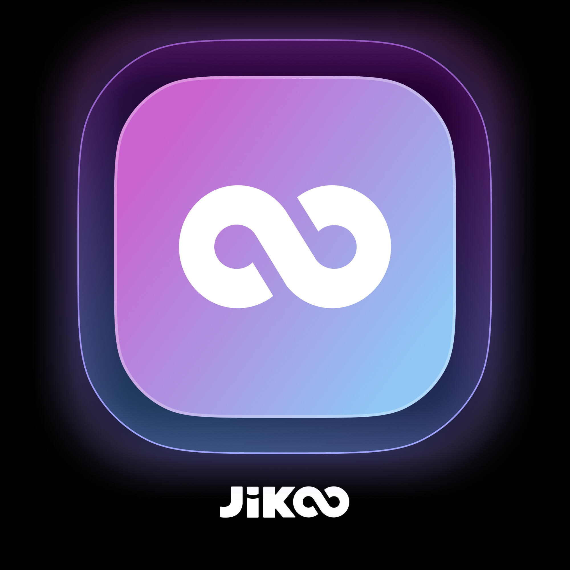
SummaryJikoo is a social app that shows users vertical videos of places to meet up, grab drinks, or go on a date nearby. I created the company's app icon and brand, while my co-founder Chris came up with the name.The word Jikoo stems from a Nigerian dialect in which it means “unbreakable bond” between friends. In the logotype, I stylized the two O’s in Jikoo to represent this infinite relationship. The logo is just a truncated form of the logotype. Its gradient background is opposite to other social media apps’ flamboyant themes. Jikoo’s marketing centres around intentional reconnection through real-world adventures and around making new memories with old friends.
An Azmain Abrer Project
Made With ♡ in Canada
Inspired by Apple in California
An Azmain Abrer Project
Made With ♡ in Canada
Inspired by Apple in California
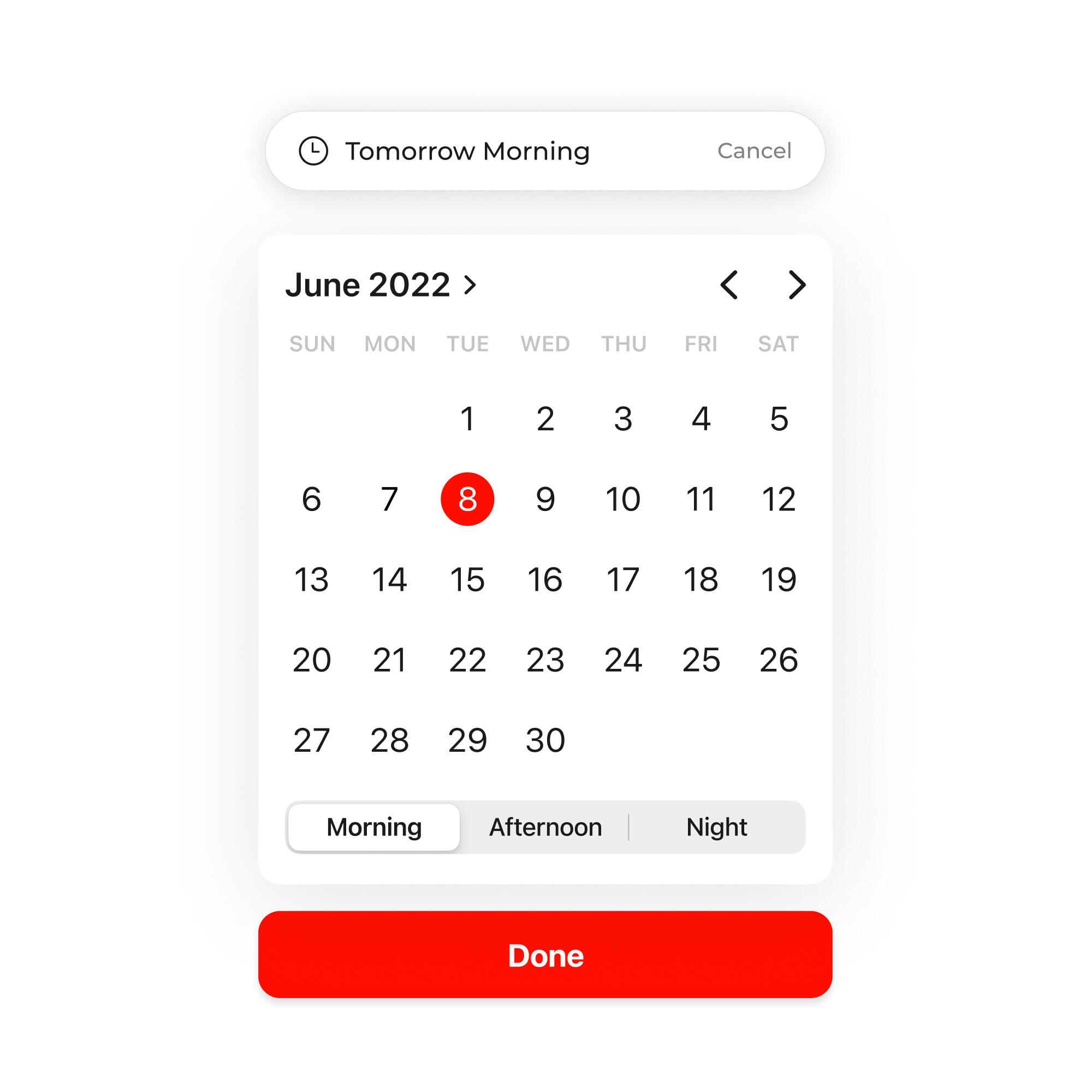
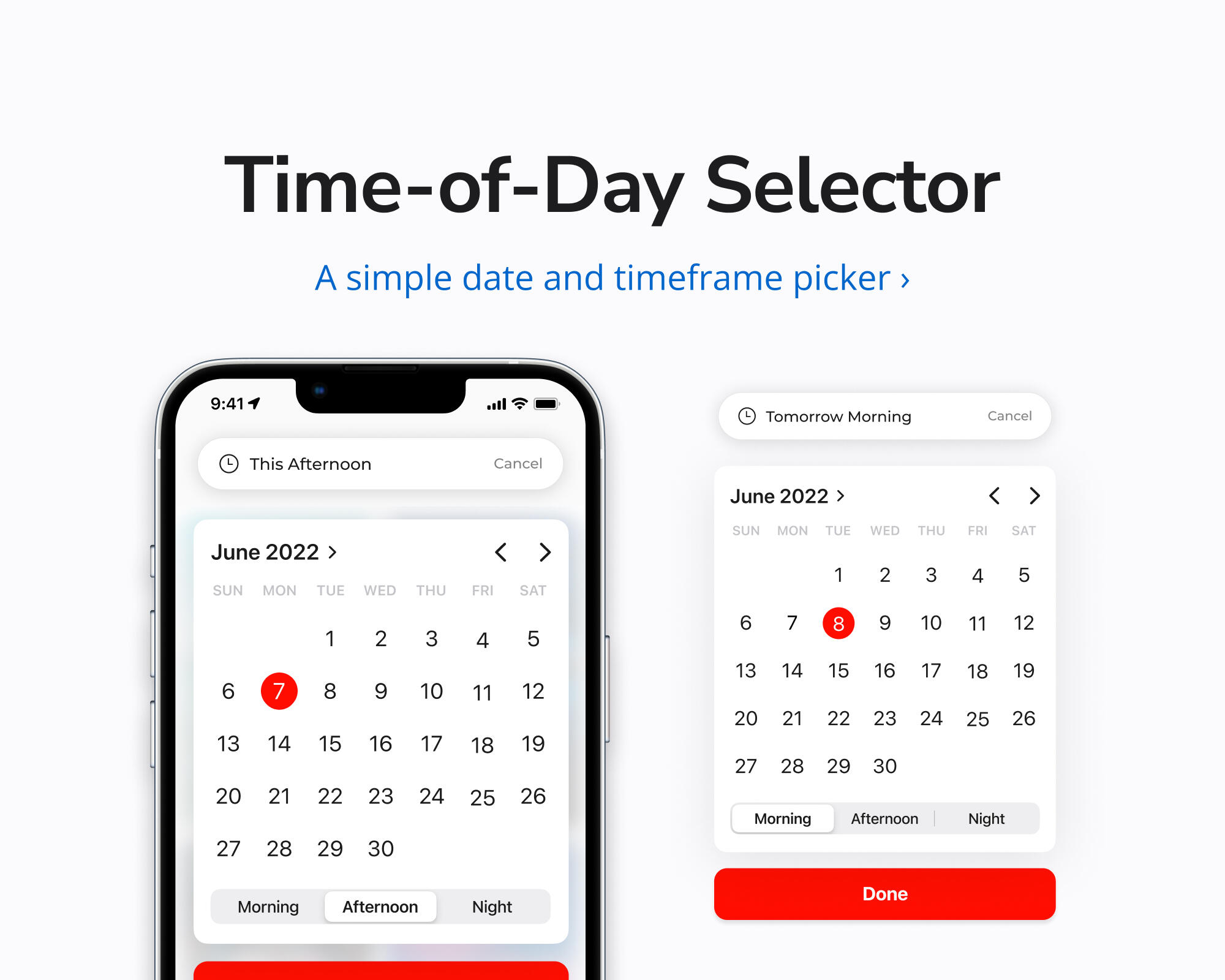
Time-of-Day Selector
Summer 2022 • Component Design, Interaction Design
SummaryAs most of us already know, the default Date Picker for iOS allows users to input a time value in the format hh:mm from their number pad.This UI component is a modified version of the familiar iOS Date Picker, which lets users select a generic time-of-day instead of forcing them to type an exact time. It's ideal for contexts in which the hh:mm format is too cumbersome or too restrictive. Like setting a reminder for tomorrow night, or filtering meeting slots for Thursday afternoon.
An Azmain Abrer Project
Made With ♡ in Canada
Inspired by Apple in California
An Azmain Abrer Project
Made With ♡ in Canada
Inspired by Apple in California
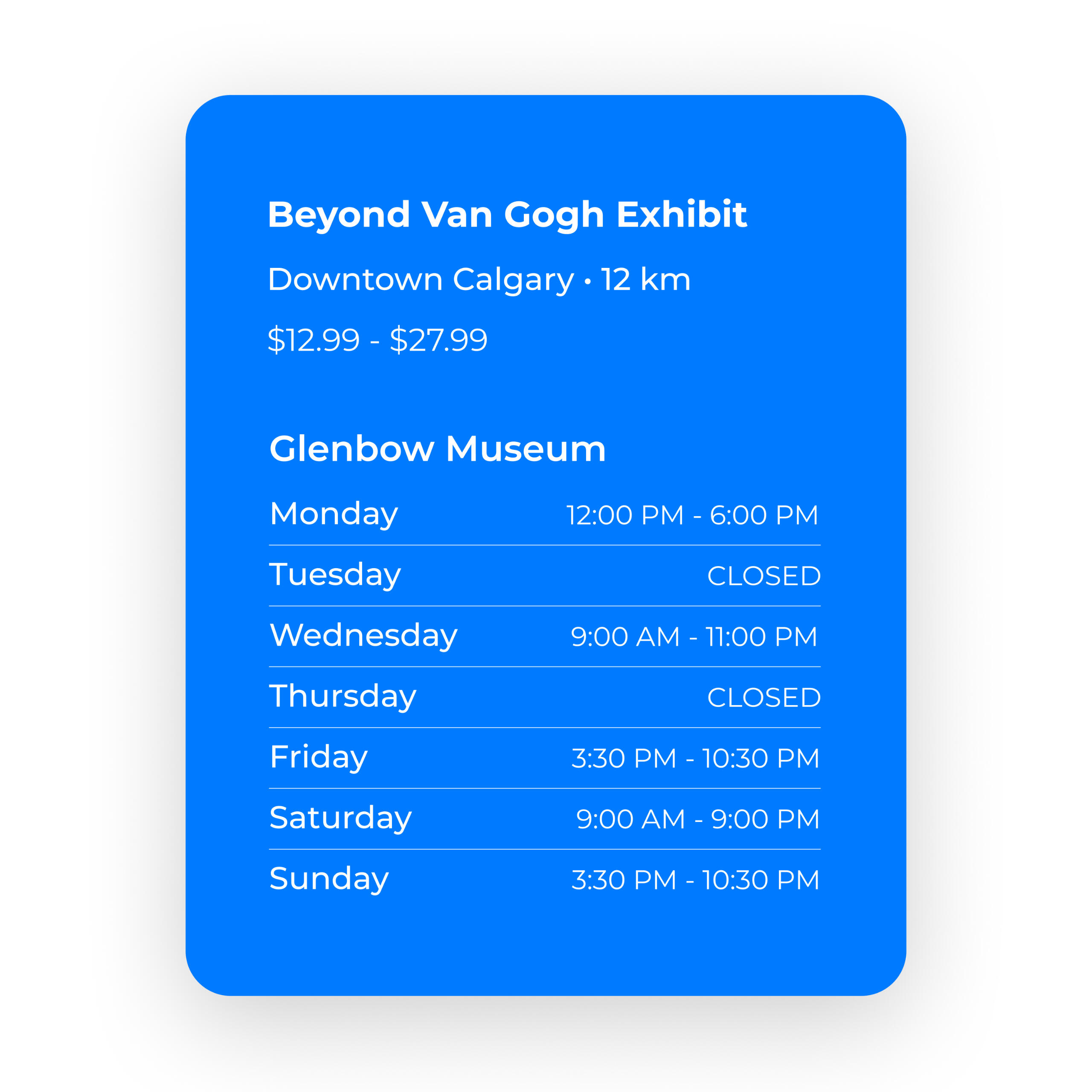
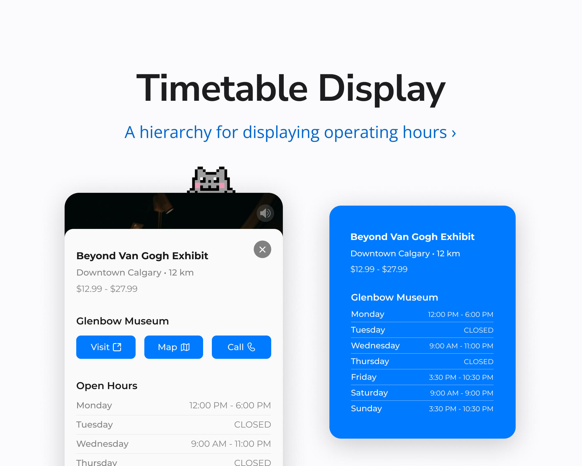
Timetable Display
Summer 2022 • Component Design, Information Design
SummaryI designed this information schema to communicate a venue's metadata and operating hours, at a glance.Notice that the overview items – such as the venue's name, district, distance, and pricing range – are grouped together above; while the specific items – like the building it's located within and the open hours of that building – are spaced separately below. This formatting lets readers decide whether they're even interested in a venue before taxing their limited attention with additional details. Font weights and subtle dividers are further leveraged to improve legibility for readers who do commit to scanning through the timetable section.
An Azmain Abrer Project
Made With ♡ in Canada
Inspired by Apple in California
An Azmain Abrer Project
Made With ♡ in Canada
Inspired by Apple in California